3 MIN READ
Kitchen
Written By
AR Abir
Published
June 3, 2026
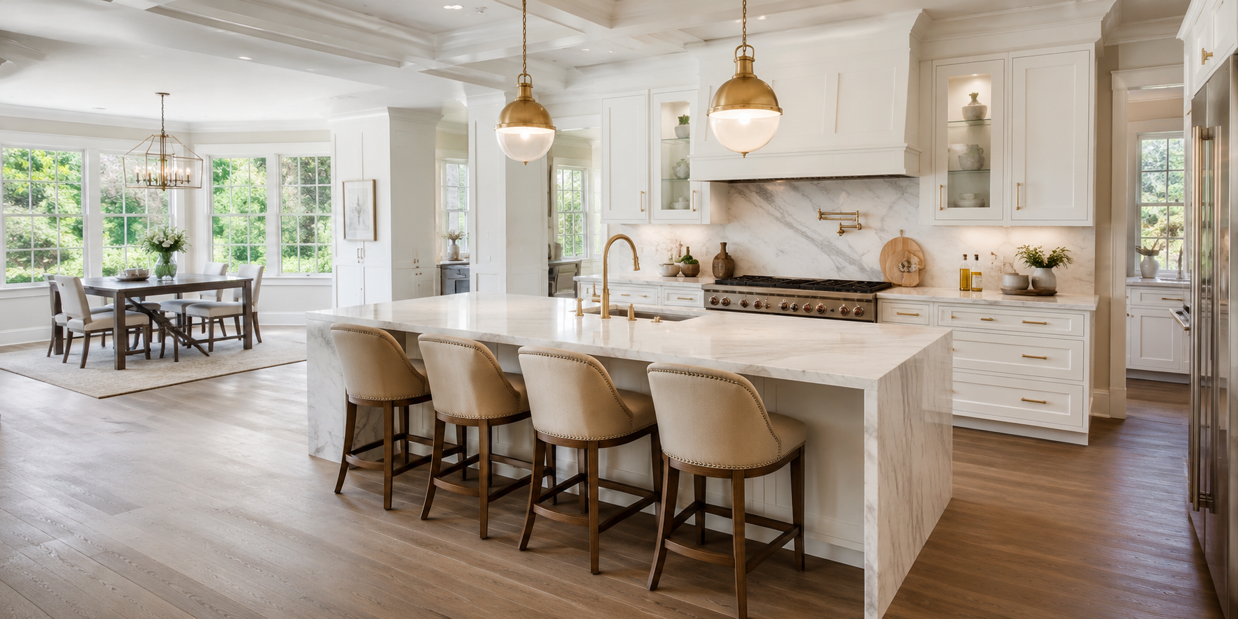
There’s a reason white kitchen cabinets have held their place at the top of every design wishlist for decades — they turn a cooking space into something that feels truly luminous. Step into a kitchen where every cabinet face is painted a clean, bright white and you immediately notice how the room seems to exhale. Natural light bounces off the surfaces, the ceiling feels taller, and the whole space invites you to linger over a slow Saturday morning with coffee and a cookbook spread open on the island.
But “white kitchen” is far from a single idea. The difference between a flat, builder-grade white and a hand-painted, oil-based off-white with a barely-there warm undertone is the difference between a room that feels cold and one that feels like a home. The choice of hardware, countertop material, backsplash texture, and flooring all amplify or soften exactly which character your white cabinets take on — whether that’s the breezy calm of a Scandinavian kitchen, the sturdy warmth of a classic English farmhouse, or the crisp confidence of a New York loft renovation.
According to Architectural Digest, white remains the most-requested cabinet color in kitchen renovations globally, and it’s not hard to understand why: white reflects light more efficiently than any other finish, making even a north-facing kitchen feel brighter and more generous in scale.
Across these 19 white kitchen cabinet ideas, you’ll find specific combinations that go well beyond “paint everything white and call it done.” Each one pairs a distinct cabinet style or finish with the materials, hardware, and accent choices that make it sing. Whether your space is a narrow galley or an open-plan kitchen diner, there’s a configuration here that will help it feel brighter, cleaner, and far more intentional.
The Shaker cabinet is the enduring workhorse of kitchen design, and for good reason. Its recessed centre panel and clean rail-and-stile frame are simple enough to read as timeless, yet structured enough to avoid looking bland. Paint those doors a bright, slightly cool Benjamin Moore White Dove or Farrow & Ball All White and pair them with unlacquered brass hardware — think elongated bar pulls on drawers and bin cup handles on lower doors — and something interesting happens. The brass, left raw and unminted, will develop a gentle patina over time, warming and personalizing a look that might otherwise feel too pristine. Complement with a white Carrara marble countertop in a honed (not polished) finish; the soft matte surface prevents the counter from competing with the cabinet brightness. A small pot of rosemary or thyme on the sill brings an organic note that softens the geometry. This combination reads as quietly expensive and thoroughly liveable — equally at home in a period terraced house as in a modern open-plan renovation. The secret is restraint: let the brass do the work of adding warmth rather than introducing too many competing tones.
High-gloss lacquered cabinet doors polarize opinion, but when executed well, they produce a kitchen that feels contemporary rather than merely fashionable. The key is pairing their reflective surface with a material that grounds the room’s energy. Honed concrete countertops — poured in a warm mid-grey, sanded to a velvety, non-porous finish — do exactly that. The matte texture of the concrete absorbs the light that the lacquer throws back, creating a dynamic push-pull that gives the kitchen visual depth. Go handleless with a push-to-open mechanism so that the cabinet faces read as uninterrupted planes. Pendant lights in brushed aluminium or bare filament bulbs suit this aesthetic better than anything ornate. The result draws from the tradition of Italian rational modernism: functional, spare, and quietly confident. This look works particularly well in longer, narrower kitchens where the reflective surfaces help push the walls apart optically. If a full concrete counter feels too industrial, a concrete-effect porcelain slab from Neolith or Dekton achieves the same visual without the maintenance demands of real poured concrete.
Where high-gloss says confidence, matte says calm. Flat-panel slab doors in a dead-matte white — think a micro-textured lacquer or a solid polymer like HDF with a matt foil — absorb light softly and give the kitchen a quality that photographs beautifully without looking clinical in person. Remove the hardware entirely: touch-latch mechanisms allow each door to spring open with a gentle push, eliminating the visual noise of pulls and knobs altogether. Pair with a continuous-run quartz countertop in pure white — Silestone Ethereal Shimmer or Caesarstone Statuario Nuvo are good benchmarks — and the result is a kitchen that reads as a single coherent object rather than a collection of parts. This approach suits contemporary homes where the kitchen connects directly to a living area; the seamless, calm aesthetic allows the cooking space to dissolve into the wider room rather than announcing itself. For a touch of grounding texture, introduce a square-format wall tile in a textured limestone-effect porcelain as the backsplash, breaking the uniform whiteness just enough to keep the room from feeling sterile.
Two-tone kitchens have earned their popularity by solving a genuine design problem: all-white can tip into cold, and all-colour can feel overwhelming. The solution is to keep the upper cabinets — which sit at or above eye level and bounce light down into the room — in bright white, while painting the lower run in a colour that grounds the space. Warm sage green is an ideal partner. Look for a shade with a slight grey-green undertone rather than a sharp botanical green: Farrow & Ball Mizzle, Little Greene Sage, or Sherwin-Williams Sea Salt all sit in this sweet spot. The sage reads as sophisticated and soothing alongside white rather than playfully colourful. Brass hardware binds both tones together, since the warm gold reads equally well against the crisp upper white and the muted lower green. This combination is popular in transitional kitchens — those caught between traditional and modern — because it honours the warmth of classic colour without surrendering the brightness that white uppers provide. Finish with a white or light-veined quartz counter to maintain the upward-reaching brightness of the space.
There’s a particular kind of charm that only beadboard can deliver — that tight vertical ribbing carries the feeling of a well-loved, old kitchen that has been freshened up rather than renovated from scratch. Applied to cabinet fronts, it softens the geometry that Shaker and slab profiles offer, giving the kitchen a texture that catches light differently as you move through the space. The ribbing runs vertically on door panels and often horizontally on the toe kick for visual contrast. Pair beadboard fronts with a deep, white fireclay apron sink — the kind that sits proud of the cabinet line and announces itself as the room’s utilitarian centrepiece. A bridge mixer tap in brushed nickel or aged pewter completes the look. Open wooden shelves in pine or oak, carrying a loosely curated collection of jugs, herb pots, and mismatched ceramics, prevent the kitchen from feeling too precious. This aesthetic speaks directly to the Cottagecore sensibility that has kept Pinterest boards busy for years, and works best in homes where the original character leans rural rather than urban.
The pure white kitchen gains enormous character when you interrupt it with open shelving in a contrasting material. Walnut — with its straight grain, rich chocolate-to-amber tones, and slightly oily surface — is the most visually potent partner for bright white cabinetry. Replace the upper cabinets on one wall entirely with floating walnut shelves: thick (at least 4cm) slabs in solid wood, supported by barely-visible steel brackets or flush-mounted wooden cleats. Style those shelves loosely — not with matching sets but with a mix of white ceramics, amber glass bottles, small trailing plants, and a few cook books turned spine-out. The warmth of the walnut softens the white below it and stops the kitchen from reading as a showroom. It also solves the most common complaint about all-white kitchens: that they feel impersonal. This combination has roots in the Japandi aesthetic movement — the blend of Japanese minimalism and Scandinavian warmth — where natural materials and neutral backdrops coexist without one overpowering the other. If solid walnut feels expensive, European oak with a warm mid-brown stain achieves a similar effect at lower cost. You might also love these ideas from our post on kitchen islands with sink and seating, which explores how to integrate functional work surfaces beautifully.
The mistake most people make with white kitchens is reaching for a stark, blue-toned bright white when the room’s light doesn’t suit it. A north-facing or smaller kitchen will almost always look colder and flatter in a true white. The answer is an off-white with a warm, slightly chalky undertone: colours like Farrow & Ball Pointing, Benjamin Moore White Sand, or Dulux Natural Hessian read as white in bright light but reveal a faint cream warmth in shadow, preventing the room from ever feeling clinical. Pair these cabinets with a limewash plaster backsplash — applied directly to the wall above the work surface and sealed with a matte waterproof topcoat — in a tone one or two shades deeper than the cabinet colour. The natural variation of limewash means no two sections are identical, and that organic imperfection is exactly what prevents the kitchen from feeling like a catalogue image. Unlacquered brass plumbing and hardware complete the Mediterranean-inflected look. The overall atmosphere is reminiscent of a sun-baked Provençal farmhouse kitchen: warm, lived-in, and quietly beautiful.
This approach inverts the usual logic of using white cabinets as the hero and treating everything else as supporting cast. Here, the backsplash steals the room. A full slab of Calacatta marble — with its dramatic sweeps of gold and grey veining against a bright white ground — runs from countertop to the base of the upper cabinets as a single continuous sheet. The drama of the stone makes the white cabinetry recede beautifully, functioning as a clean frame that lets the marble’s natural artwork speak. Choose white Shaker or simple inset cabinets so the door profile doesn’t compete. Hardware in polished brass or soft gold picks up the warm veining tones. If the budget doesn’t stretch to natural stone, large-format porcelain slabs from Florim, Porcelanosa, or Atlas Concorde replicate the Calacatta aesthetic with outstanding technical performance and more consistent patterning. The countertop can either match the marble — extending the slab across the work surface for a seamless, gallery-like effect — or step back into a simpler white quartz, allowing the backsplash to remain the clear focal point.
Storage is the unglamorous problem that kitchen design perpetually tries to solve, and floor-to-ceiling pantry cabinetry — designed as a dedicated bank of tall units — is one of the most satisfying answers. These tall columns of white cabinetry, running from floor to ceiling on one wall, transform storage from a compromise into an architectural feature. The key is to specify the interior fitout thoughtfully: pull-out larder drawers in the lower sections, adjustable shelving in the mid-section, and dedicated zones for appliances with retractable doors that hide the kettle and toaster when not in use. The external faces should remain as clean as possible — flat-panel or simple Shaker doors, all in the same white, with a single horizontal bar handle running continuously across every door at the same height for visual rhythm. When closed, this wall of cabinetry looks like a single, considered installation. Integrated toe-kick lighting adds a warm horizontal glow that makes the bank of cabinetry feel lighter and prevents it from looking oppressively heavy.
The farmhouse apron sink is one of those design elements that carries so much accumulated goodwill — years of Sunday lunch preparations, flower-arranging, and post-garden hand-washing — that it practically radiates warmth on its own. When you frame it with white Shaker cabinetry and step back, the sink becomes the kitchen’s natural focal point. The cabinetry on either side should mirror the sink’s understated formality: simple Shaker doors in Benjamin Moore OC-17 White Dove or similar, with polished nickel or pewter cup handles. A linen or woven roman shade at the window above the sink softens the light falling into the space and adds an earthy texture against all that clean white. Keep the countertop practical and humble — honed white marble, a matte quartz, or even oiled hardwood — rather than anything too precious. This configuration acknowledges the kitchen for what it fundamentally is: a workspace where real life happens. White shiplap walls pair particularly well with this farmhouse kitchen approach, and our guide to white shiplap accent wall ideas shows exactly how to bring that texture in without overwhelming the space.
Glass-front cabinet doors earn their place in the kitchen by doing double duty: they lighten the visual weight of upper cabinetry and turn everyday crockery and glassware into part of the room’s decor. The frame profile matters. Divided-light cabinets — those with multiple small panes in a grid — evoke a slightly more traditional sensibility. Single-pane glass inserts, particularly in a wider, more contemporary frame, sit better in modern kitchens. Specify low-iron glass (sometimes sold as Starphire or Optiwhite) rather than standard float glass; the difference is that standard glass has a green tint visible at the edge, while low-iron glass is crystal clear, meaning the glassware and china behind it reads at its true colour. Interior cabinet lighting — a small strip of warm LEDs at the top of the carcass — turns the display into something spectacular after dark. Curate the contents carefully: a run of identical white dinner plates, a stack of wide pasta bowls, and a row of matching glasses is always more visually satisfying than a random collection of mismatched pieces.
The kitchen island has become a canvas for colour experimentation precisely because it sits at a slight remove from the perimeter cabinetry — different enough to justify a different treatment, connected enough to need a conversation with what surrounds it. Deep navy blue — a colour like Farrow & Ball Hague Blue, Little Greene Indigo, or Benjamin Moore Newburyport Blue — is the most confident choice. Against the white perimeter cabinets, navy reads as architectural and assured rather than merely colourful. Specify the same hardware across both — unlacquered brass bar pulls work on white and navy equally — to tie the two elements into a cohesive whole. The countertop on the island can match or contrast: a white marble counter across the island, matching the perimeter, maintains visual calm; a darker surface like black granite or dark soapstone creates a more dramatic moment. Either works. The navy island becomes the visual anchor that prevents an all-white kitchen from feeling weightless or unresolved. A group of matching pendant lights above the island in a complementary metal finish completes the composition.
There is a particular warmth in a kitchen that looks as though it has always been there — not faded or neglected, but settled and familiar. Antique white achieves this: it’s not the stark clarity of a fresh-painted Shaker but a colour with a slight depth, as if the white were painted over something warmer and that warmth is quietly showing through. Farrow & Ball String, Benjamin Moore Linen White, or Sherwin-Williams Antique White sit in this territory. The rubbed oil bronze hardware is essential to the look: those pulls and knobs, in their darkened bronze with just a hint of red-brown warmth, carry the same sense of age and honesty as the cabinet colour. This combination works beautifully in an older home with existing period details — cornicing, dado rails, original floorboards — because it doesn’t try to modernize aggressively. Countertops in honed limestone or a creamy tumbled-stone mosaic backsplash complete the picture. The overall atmosphere is of an Italian farmhouse kitchen, or a French country maison: unpretentious, warm, and deeply inviting.
Inset cabinetry — where the door sits flush within the frame rather than overlapping it — is a mark of traditional American craftsmanship and signals a kitchen built to the highest joinery standard. The door’s flush-set precision means every hinge, every gap, every plane alignment is visible, which makes the build quality impossible to hide. Add a beaded frame detail — a thin routed bead running around the inside perimeter of the face frame — and the cabinetry gains a refinement that simpler overlay doors cannot replicate. Paint the cabinets in a clean white: Benjamin Moore Chantilly Lace is the benchmark here, a pure white without any yellow or grey that reads brilliantly under both warm artificial light and cool daylight. Polished nickel or chrome hardware — small, understated bin pulls or classic round knobs — suits the precision aesthetic. This cabinetry style draws directly from the long tradition of New England kitchen design, where joinery quality was considered a measure of the household’s standards. It pairs best with honed stone countertops and simple white subway tile rather than anything too architectural.
If the white-and-brass kitchen is warmth incarnate, the white-and-black kitchen is its cooler, more sculptural counterpart. The logic is simple: white cabinets provide the bright, light-reflective ground; matte black hardware — long bar pulls or square cup handles — provides the punctuation; and dark soapstone or black honed granite countertops provide a deep horizontal band that grounds the whole composition. The contrast is stark but not harsh, because both the white and the black are matte rather than reflective, giving the palette a softness that gloss finishes would undermine. A white subway tile backsplash with a dark charcoal grout — rather than white grout — keeps the palette consistent while adding textural interest. This approach reads as modern and resolved, without being fashionable in a way that dates quickly. It references the pared-back design traditions of Scandinavian design studios: functional, deliberate, and quietly confident. The kitchen feels like a place where serious cooking happens.
Zellige tile — the handmade Moroccan ceramic with its naturally uneven surface and subtly varying glaze — is one of the most tactile and characterful backsplash materials available to a kitchen designer, and its particular appeal against white cabinetry is that it introduces warmth and variation without introducing colour. In ivory, cream, and bone tones, Zellige tiles shimmer with dozens of micro-facets that reflect light differently across each square, creating a surface that looks like still water caught in afternoon sun. Pair with white Shaker cabinets for the warm, bohemian-Mediterranean sensibility that Zellige naturally evokes. Aged brass or antique gold hardware and a linen-coloured countertop in honed limestone or a cream-toned quartz complete the look. This combination works particularly well in a kitchen that opens onto a garden or courtyard, where the warm, handmade quality of the tiles connects visually with the natural world beyond the window. The tiles are typically set in a running bond (brick) pattern, which lets the slight surface irregularities catch light across the diagonal joint lines.
Butcher block is the honest, utilitarian material that makes an all-white kitchen feel lived-in rather than aspirationally staged. The warmth of oiled hardwood — maple, beech, or walnut end-grain — against cool white cabinetry creates a contrast that is both visually satisfying and practically appealing: hard-wearing wood for the prep sections of the counter, sealed or tiled for the sections adjacent to the sink. This combination has roots in the working farmhouse kitchen, where the wood counter was simply the most practical surface available, and that sense of purposeful simplicity is a large part of its ongoing appeal. The key maintenance commitment is oiling every few months with a food-safe oil — raw linseed, mineral oil, or a dedicated butcher block conditioner — which keeps the grain from drying and prevents the surface from absorbing stains. The resulting patina deepens beautifully over years, making the counter more characterful with age rather than more worn. This is the counter that records the household’s history in its surface.
One of the most common complaints in kitchen design is wasted space: that awkward gap between the top of the upper cabinets and the ceiling, which collects dust and props up mismatched storage baskets. The solution is to stack the cabinetry — adding a second, shallower tier of cabinets above the standard uppers — and running the whole bank all the way to the ceiling with a crown moulding to finish the transition. In white, this creates a kitchen that feels architecturally complete: the cabinetry becomes a wall-height installation rather than furniture hung at an arbitrary height. The additional storage in the upper tier, reached by a rolling library ladder or a simple step stool, is useful for items used seasonally — large stockpots, roasting pans, preserving jars. The crown moulding profile matters: in a traditional kitchen, a classical ogee or cove moulding in white-painted timber reads as considered; in a more contemporary setting, a simple square-edge moulding or a shadow gap (a small dark recess where cabinet meets ceiling) achieves the clean finish without the historicism.
The floor is the largest surface in any kitchen, and in a room of white cabinetry, it carries a disproportionate amount of design responsibility. Encaustic cement tiles — poured with coloured pigment and geometric patterns set before the clay hardens — offer something no porcelain tile can replicate: a depth and hand-made variation that makes each tile subtly individual. In a black-and-white geometric pattern — eight-pointed stars, Moorish lattice, or classic checkerboard — the floor creates a bold counterpoint beneath all that clean white cabinetry. The cabinets above recede and the floor becomes the feature, which is a clever reversal of the usual kitchen logic. Seal the tiles well before use and reseal annually; cement tiles are porous and will absorb oil and wine if left unprotected. The aesthetic they produce references the tradition of Mediterranean and North African tile-making, and these floors are at their best in kitchens that open directly onto a garden or courtyard, where the indoor-outdoor connection and the artisanal quality of the tiles reinforce each other. The warmth of the pattern grounds the white cabinetry and prevents the room from feeling too airy or insubstantial.
White kitchen cabinets are not a trend — they are a design constant, and these 19 ideas demonstrate exactly why. Whether you’re drawn to the handmade warmth of beadboard fronts paired with a limewash plaster backsplash, the architectural boldness of a navy island anchoring an otherwise all-white room, or the quiet luxury of stacked cabinetry reaching a crown-moulded ceiling, there is a white kitchen configuration here that will serve you for decades rather than seasons. Start with the detail that excites you most — perhaps those unlacquered brass pulls that will warm slowly with age, or the first square metre of Zellige tile installed above the hob — and let the rest of the kitchen build around it. Even a single weekend spent upgrading the hardware on existing white cabinets can shift the room’s entire atmosphere. Pin the ideas that feel most like home, and take the first step toward the bright, clean kitchen you’ve been picturing.
AR Abir
06-03-2026
Let’s Build
Contact us todayGet daily tips and tricks for making your best home.
2025 Green to Gorgeous