There’s a specific kind of calm that washes over you the moment you step into a room painted in sage green — a feeling somewhere between walking barefoot on dewy grass and breathing in cool morning air. It’s not the drama of forest green or the sweetness of mint; it’s quieter than that, more considered. Sage carries grey undertones that ground it, making it read differently in morning light versus golden-hour lamplight, shifting from silvery-cool to warmly earthy as the day moves. That quality is precisely why interior designers have championed sage green as one of the most livable colours a living room can wear.
The real magic of sage green is its refusal to compete. It sits comfortably beside natural linen, aged brass, washed oak, and warm cream — materials that feel like they have been in a room forever. Because of this, a sage green living room tends to feel considered and curated without feeling over-decorated. It pulls the outdoors in, creates a visual breath between furniture pieces, and gives every accessory just enough backdrop to shine without fighting for attention. If you have been following the sage green kitchen trend that has taken hold of cabinetry design, bringing the same tone into your living space creates a beautifully cohesive whole.
Whether you are drawn to the crisp formality of a sage green panel wall paired with cane furniture or the relaxed warmth of sage walls wrapping around a broken-white sofa, this colour rewards commitment. In the ideas ahead, you will find 18 distinct takes on the sage green living room — from maximalist, layered spaces to pared-back retreats — each rooted in specific materials, proportions, and pairings that actually work.
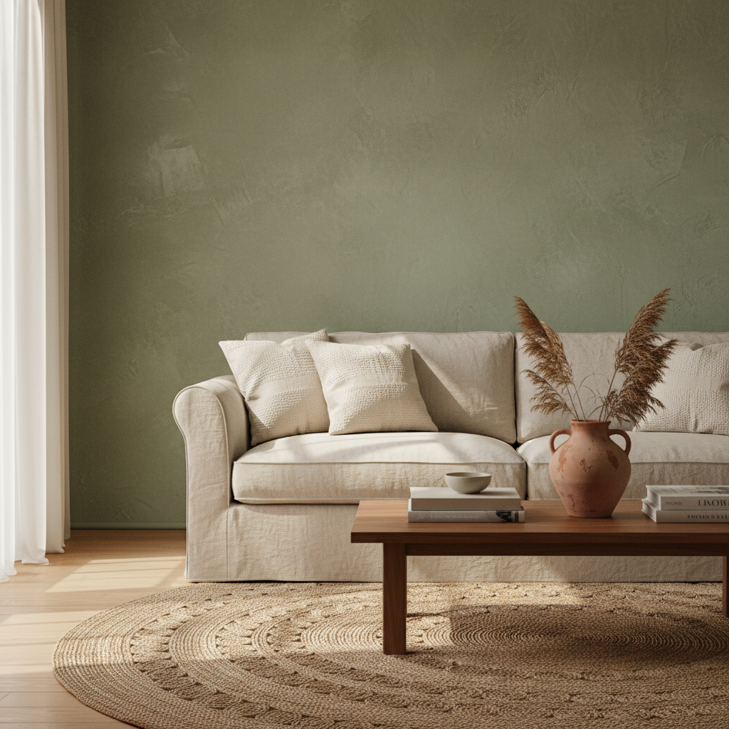
There is a softness to a limewashed sage green wall that flat paint simply cannot replicate. The technique — where thinned, chalky paint is brushed on and then partially rubbed back — produces a surface with subtle variation: slightly darker in the recesses, paler on the raised texture of the plaster or drywall beneath. Against this backdrop, raw linen sofas in oatmeal or pale flax feel almost inevitable, as though the two materials were designed to coexist. The natural slub of linen echoes the irregularity of the limewash, creating a layered tone-on-tone composition that reads as effortlessly warm rather than carefully staged.
Keep the rest of the palette lean — aged terracotta in a single vase, a jute rug underfoot, and a low walnut coffee table. The limewash technique works particularly well in rooms with some natural plaster imperfections; rather than hiding them, it absorbs them into the aesthetic. Clay-based limewash paints from specialist suppliers work beautifully, though a skilled DIYer can achieve similar results with diluted chalk paint applied with a broad natural-bristle brush. Work in small sections and rub back while wet for the most authentic effect. The result is a room that feels like it has been there — and been loved — for decades.
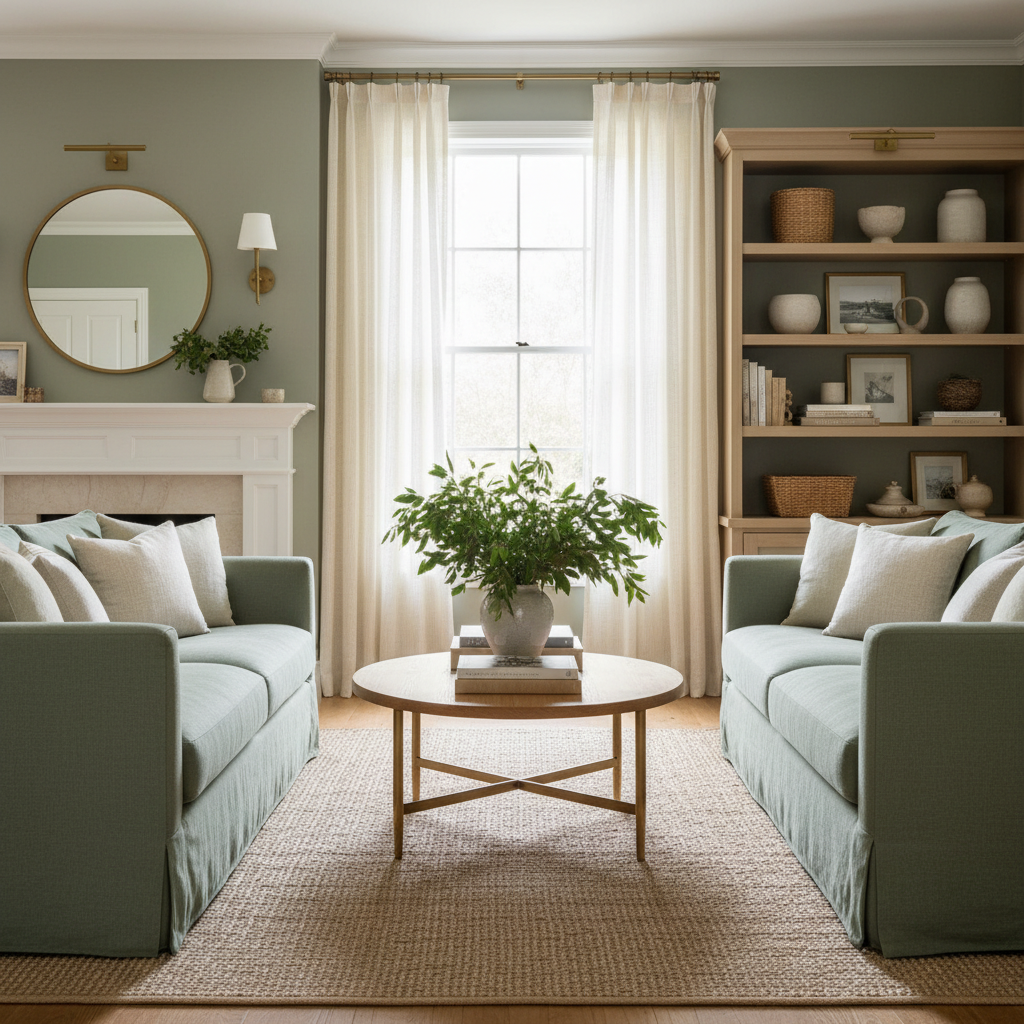
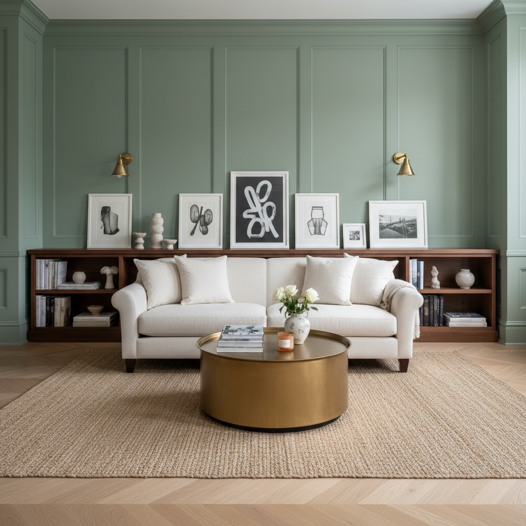
Full-height wall panelling painted in sage green is one of the most effective ways to make a living room feel architecturally rich without an expensive renovation. Whether you choose simple flat-board panelling, classic raised-and-fielded frames, or a more contemporary grid of thin battens, painting them all a consistent sage green — skirting boards, architraves, and all — wraps the room in a single, commanding tone that feels far more deliberate than an accent wall alone. Against this, deep cream or warm ivory upholstery creates a relationship that designers describe as tone-stepping: a controlled contrast where neither colour shouts.
Choose sofas with tight, clean lines and legs in oiled walnut or bronze-finished steel to avoid the scheme feeling too soft or saccharine. Add brass picture lights angled over framed prints for a layer of warmth, and run a wide, low bookshelf along the longest panelled wall to give the sage green something to interact with in three dimensions. The key rule here is consistency: paint everything in the panel zone the same colour. Inconsistency — a white skirting board beneath a sage panel wall, for instance — breaks the spell entirely and reduces what could be a striking architectural statement into an incomplete project.
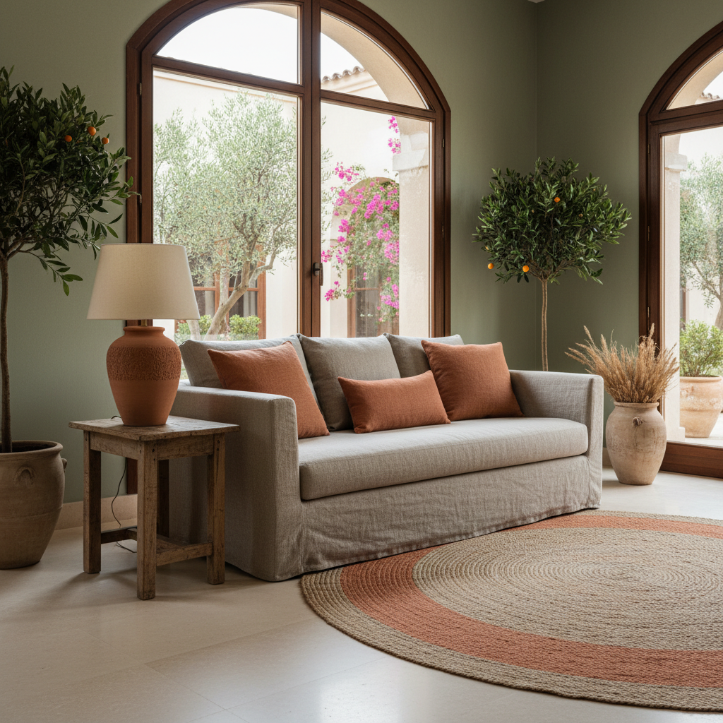
The combination of sage green and terracotta is one of those rare colour pairings that is both unexpected and completely intuitive — two earthen tones sharing the same low saturation, creating harmony rather than collision. Sage green on the walls reads as the cooler counterpart, while terracotta in cushions, a ceramic lamp base, or an earthenware pot on the coffee table brings warmth and a quietly Mediterranean energy that prevents the room from feeling too cool or clinical. This pairing draws from the colour principle of analogous earth tones: both colours carry brown and grey undertones that keep them from clashing even in large quantities.
The effect is particularly striking when you introduce a warm sisal or wool rug with a terracotta stripe running through it — it ties the scheme together without requiring you to deliberately match cushions to walls. Terracotta accents work best in odd groupings: a stack of three books in a warm-toned cover, two ceramic vessels of different heights, one woven blanket folded over a sofa arm. The irregularity makes the room feel curated rather than theme-purchased from a single retailer. This is an approachable palette entry point for anyone who wants the warmth of an earthy interior but isn’t ready to commit to a full repaint — sage green walls with terracotta accents can be phased in gradually through accessories alone.
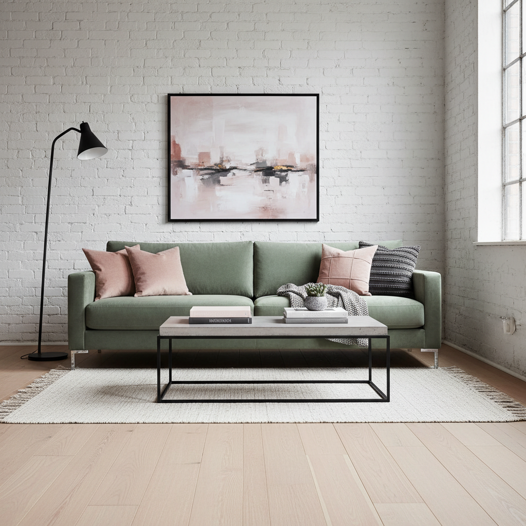
A sage green velvet sofa is one of those investment pieces that changes the entire conversation of a room. Velvet in this particular hue catches the light differently at every angle — bluer in shadow, warmer in direct sun — and against the raw, honest texture of a white-painted brick surround, the contrast becomes quietly theatrical. The brick’s texture provides all the visual interest the wall needs, while the sage velvet brings colour depth and softness to the foreground, preventing the room from reading as too industrial or raw. The balance between organic imperfection and refined material is what makes this pairing so compelling.
Keep the floor clean and grounded: wide-plank pale oak or warm polished concrete both work well, preventing the scheme from becoming too heavy in either direction. Layer the sofa with cushions in dusty blush and cool grey linen to pick up both the warm and cool readings of the velvet without introducing a third strong colour. The white brick surround can be painted using a breathable lime-based paint if your existing brick is darker — this preserves the texture while unifying the wall into a single, matte plane. This look has a distinct Scandinavian-meets-industrial edge that suits urban apartments, converted warehouses, and older terraced houses in equal measure.
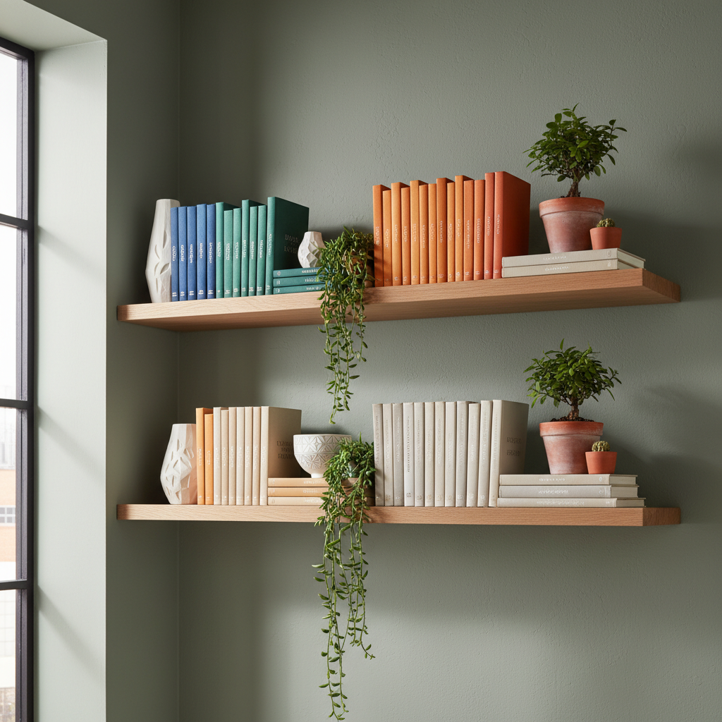
Floating shelves in solid natural oak mounted against sage green walls create a built-in feel without the cost or permanence of actual joinery. The grain and warmth of the oak acts as the perfect foil for the muted coolness of sage — a pairing that appears constantly in Japandi and Nordic interiors because it resolves the tension between the natural and the restrained. Mount shelves at two heights, staggered across the wall rather than stacked vertically, to create a composition that feels designed rather than storage-driven.
Style the shelves with a deliberate mix: books with spines facing out grouped by colour, simple white ceramic objects, and one or two small plants in terracotta pots. The styling principle here is negative space — leave at least thirty percent of each shelf empty. Overcrowding shelves in front of a sage green wall competes with the colour rather than complementing it; the green needs room to breathe. Aim for shelf depth of at least 25cm to allow books and objects to sit naturally rather than precariously. Pair the oak with a sage-painted skirting board to maintain the colour flow from floor level up to the shelf zone, so the architecture reads as intentional from every part of the room.
One of the most elegant ways to elevate a sage green living room is through the considered introduction of soft gold and antique brass hardware. Unlike bright polished gold, aged brass and brushed gold tones share the same grey undertones as sage, which means they harmonise rather than contrast in a way that feels rich rather than flashy. Picture frames in brushed gold, a console table with thin brass legs, a table lamp with a brass base and a linen drum shade — each piece contributes warmth and a sense of permanence that sage green on its own can lack.
Layer in an antique mirror with a slightly foxed, tarnished frame above the mantel or against the longest wall; the imperfect reflection of sage green multiplied creates a depth that feels more layered and considered than a simple colour repetition would produce. Foxed mirrors — where the silver backing has slightly degraded over time, producing dark, mottled spots — are widely available through antique dealers and specialist reproduction suppliers, and they add age and authenticity that no new mirror can replicate. The critical rule when working with brass and gold in this palette is restraint: two or three elements, not seven. When brass saturates a room, it shifts from sophisticated to busy. Edit with intention, and each piece will feel placed rather than accumulated.
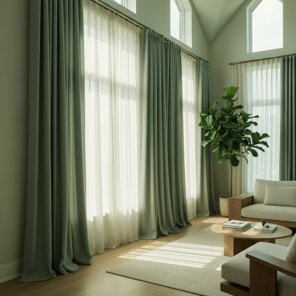
Window treatments in sage green are one of the most underused ways to introduce this colour without committing to a full repaint. Long, floor-pooling curtains in sage linen or sage velvet — hung from a ceiling-height rod to exaggerate the vertical space — transform even an ordinary window into something architectural. Layer them over sheer ivory or white muslin underlayers that soften the incoming light: the result is a room bathed in a gentle, subtly warm-green-tinted glow that feels almost like sitting outdoors beneath a leafy canopy. The quality of this light is deeply calming in a way that bare windows or opaque roller blinds simply cannot produce.
This treatment works particularly well in south- or east-facing rooms where strong light can otherwise bleach colours flat and make even warm tones feel cold and overexposed. The pooled length at the base of the curtain adds visual weight at floor level, which grounds the room and makes ceilings feel taller by contrast — a classic trick of proportion. Choose curtains with a subtle texture — raw linen weave or a loose boucle blend — rather than flat blackout fabric. The light needs something to interact with to create that living, layered quality. A single curtain rod in brushed brass or matte black completes the look without distracting from the fabric itself.
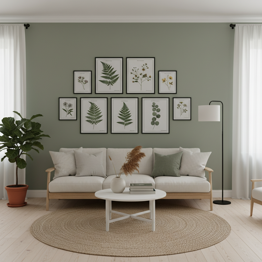
A gallery wall becomes something entirely different when the surrounding wall is sage green. Botanical prints — pressed fern studies, eucalyptus sprays, simple watercolour leaf illustrations — feel like a natural extension of the colour behind them, as though the wall itself is exhaling into the artwork. Choose thin black frames for graphic clarity; the fine black lines read almost like pen strokes against the muted sage, creating a tidy structure that prevents the arrangement from looking cluttered or chaotic. Vary the frame sizes (A4, A3, A2, and a square format) but keep every frame the same finish — that consistency is what holds a varied arrangement together.
Arrange with the largest print as a visual anchor near the centre, stepping outward from there with smaller frames at natural intervals. Botanical prints are among the most accessible art options: many are available as free downloads from archives, or as affordable limited editions from independent printmakers. This combination also reflects the principles of biophilic design — the evidence-based approach of incorporating natural references into built environments to reduce cortisol levels and improve the lived experience of interior spaces. Sage green walls behind botanical artwork is biophilic design in its most accessible, affordable form.
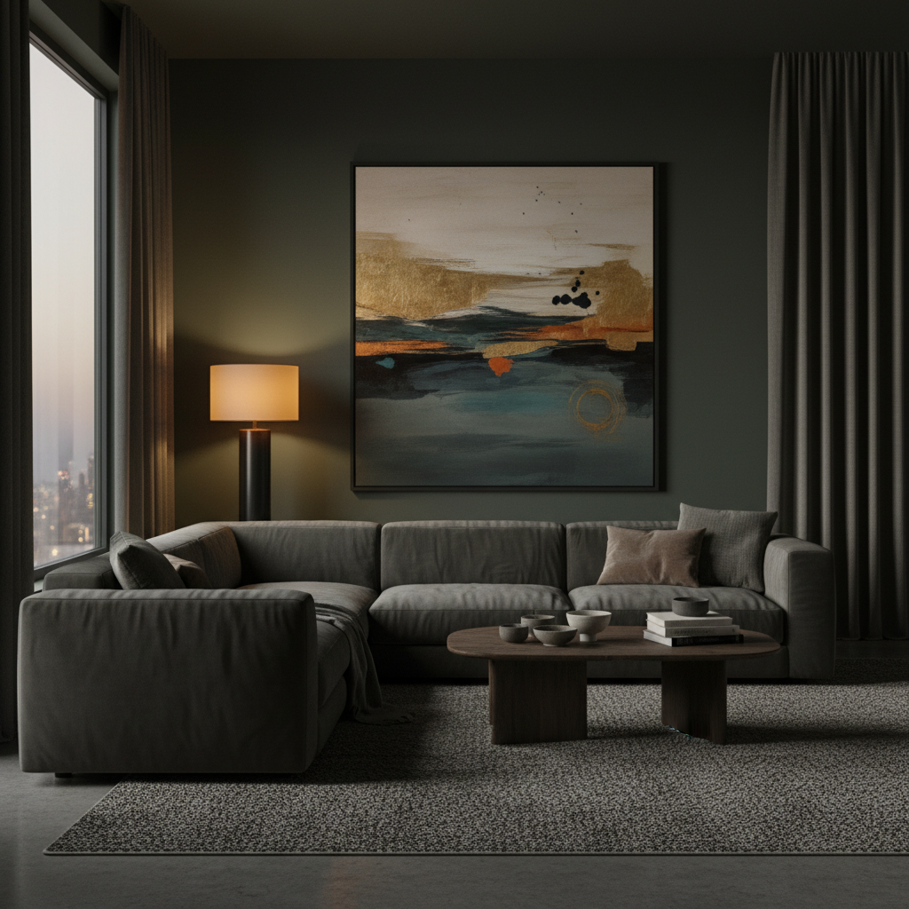
Not all sage greens are created equal. While many lean silvery and light, there is a deeper register — sometimes called dark sage or sage with a forest lean — that sits closer to a muted olive while still carrying the same grey undertones. In a living room with low ambient lighting, this darker sage creates a cocooning, enveloping atmosphere that works brilliantly for evening spaces, dedicated media rooms, or north-facing rooms that never flood with natural light. The key is to lean into the depth rather than fight it.
Use warm-toned bulbs (2700K) in pendant lights and table lamps so the light source always reads as amber rather than white. Choose furniture in deep chocolate leather or warm charcoal boucle, and add texture through a large flatweave rug in dark amber or rust. Dark sage works particularly well in rooms with high ceilings where the colour can climb uninterrupted and create a sense of enveloping richness rather than compression. Avoid stark bright white in this scheme — it snaps the mood abruptly and makes the dark sage look muddy by comparison. Instead, use aged off-white or warm stone on any architectural details, such as a plaster cornice or an original fireplace surround, so the contrast is gentle rather than jarring. A single large-format artwork in charcoal and cream gives the eye a resting point without breaking the room’s atmosphere.
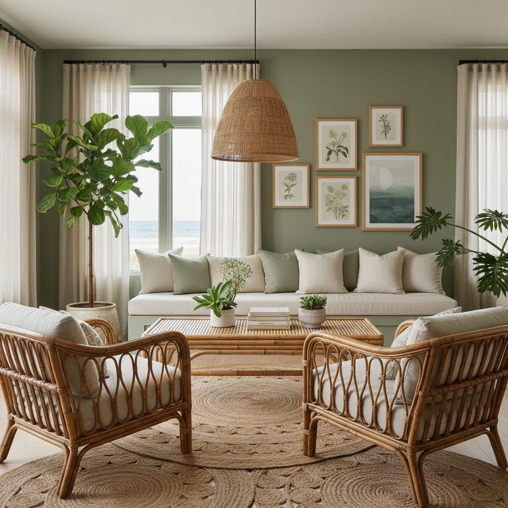
There is a quiet, tropical-meets-coastal ease to a sage green living room furnished with rattan chairs, woven pendant lights, and layered jute rugs that has proved deeply enduring. The combination works because every element in it is derived from natural materials: sage green speaks to plants and foliage, rattan to cane and grass, jute to woven fibres harvested from the soil. In a room where every surface references the natural world, the interior stops feeling like a designed space and starts feeling like an extension of the outdoors.
Choose rattan armchairs with loose cushions in undyed linen or a faded awning stripe, and pair them with a low bamboo or cane coffee table over a large jute rug. A second, smaller rug in a natural wool flatweave can be layered on top at a slight angle to add visual depth — the layered rug technique originated in North African and Moroccan interiors and it remains one of the most effective ways to add warmth and texture to a room with a pale or hard floor. Keep the walls in a lighter sage (a 50–60% version if your paint allows) to let the furniture’s natural tones take prominence rather than receding into a darker backdrop. Pendant lights in woven seagrass or bamboo complete the scheme by keeping the overhead plane consistent with the materials story unfolding below.
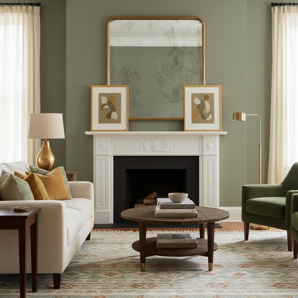
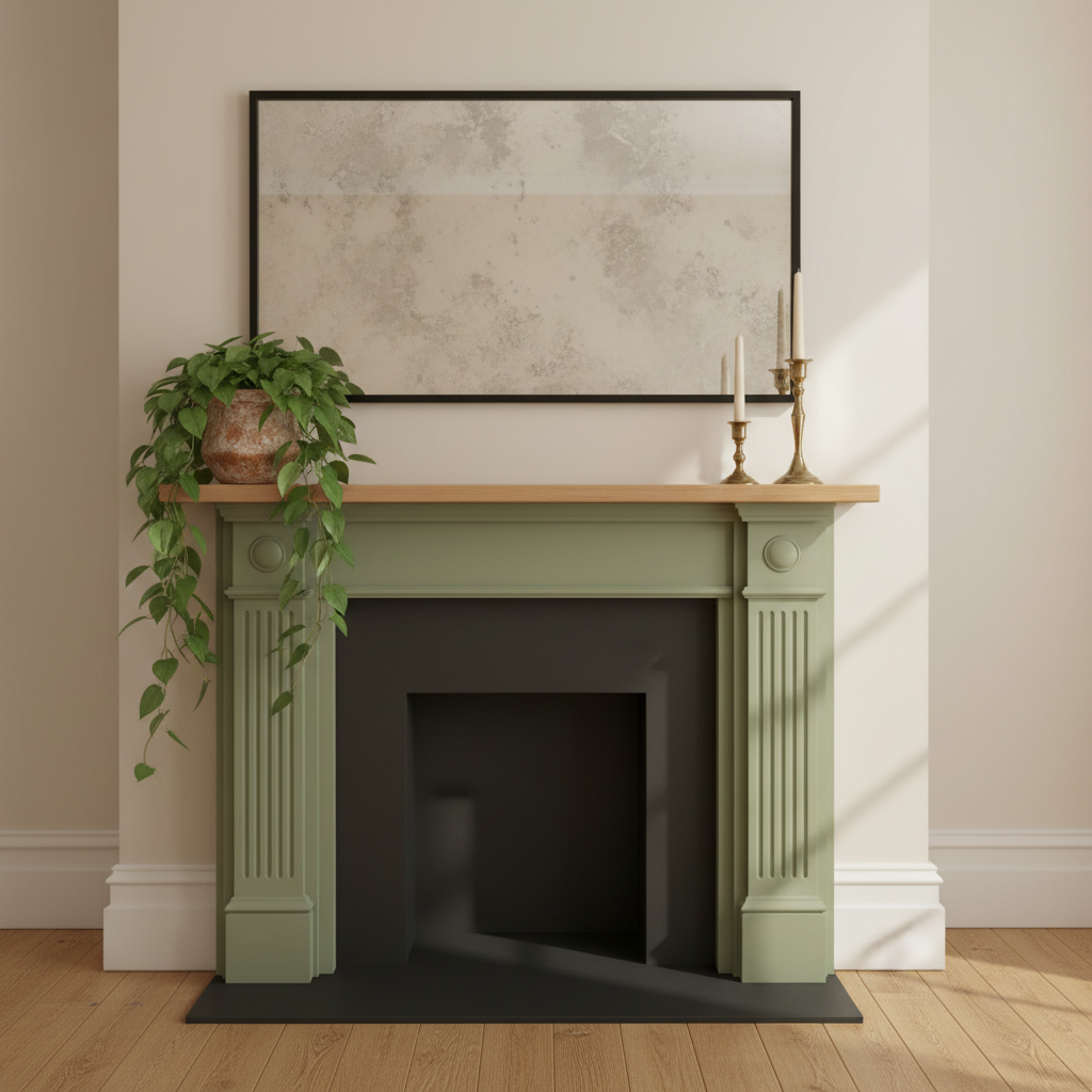
Painting just the fireplace surround — the frame around the firebox, the side columns, and the base plinth — in sage green while keeping the mantel shelf in cream or soft white is a targeted, high-impact move that costs very little but changes everything about the room. The sage green immediately draws the eye toward the fireplace as the room’s focal point, which is exactly what a fireplace should be but often isn’t when everything in the room registers at the same tonal weight. The cream mantel shelf creates a clean separation between the sage zone and the chimney breast above, allowing the upper wall to remain white or neutral without any abrupt colour transition.
Style the mantel simply: a large-format mirror with a thin cream or brushed brass frame, two candlesticks of differing heights, and a single trailing plant in a simple terracotta vessel. Resist the urge to overcrowd — the strength of this idea lies in the clarity of the sage surround as a single deliberate statement. This technique works beautifully on existing painted fire surrounds: a good oil-based primer and two coats of eggshell in your chosen sage will adhere with minimal preparation. It can also be reversed in a weekend if your taste changes, which makes it one of the lowest-risk colour experiments in any living room refresh.
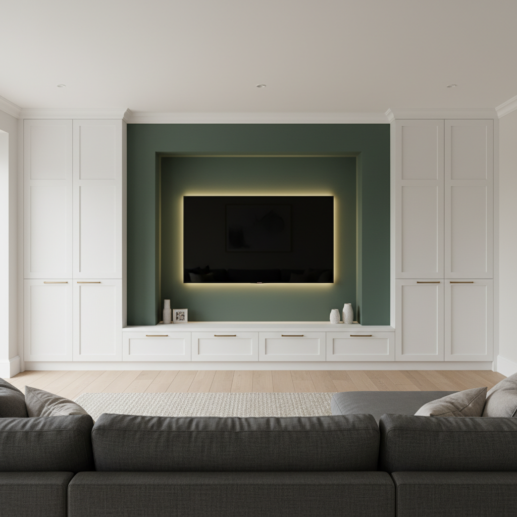
The media wall is often the design afterthought in an otherwise considered living room — a flat, functional expanse that exists only to hold a screen. Painting the recess behind a wall-mounted television in a deep, rich sage green — while keeping the flanking built-in storage units in warm white — instantly elevates the wall into a considered design moment. The sage green recessed zone visually frames the screen and anchors it, rather than leaving the television floating against a bare or busy surface. The dark-to-light contrast between the sage recess and the white cabinetry creates the same effect as a matted picture frame: it draws attention inward.
Add brass or antique bronze hardware to the built-in storage units to tie the metal finish to other elements elsewhere in the room, and illuminate the recess with a slim LED strip along the top edge to create a soft backlight behind the television — this reduces eye strain in dim viewing conditions while giving the sage green zone a subtle, glowing depth. For the built-in storage, use a combination of closed cabinets at the base (for set-top boxes and gaming consoles) and open shelves above for curated display. Keep the open shelves sparse: one or two ceramic objects and a plant, styled against the sage backdrop, are far more effective than a crowded collection. A room with this kind of considered media wall rarely needs any other feature to feel complete.
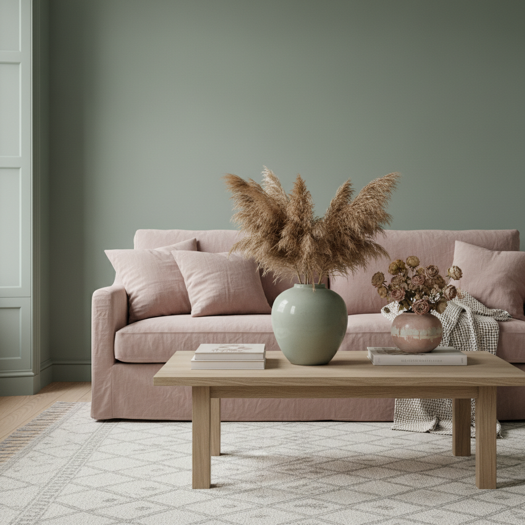
Sage green and dusty blush sit at opposite ends of the warm-cool spectrum within the same muted, low-saturation family — which is precisely why they work together so well. Neither colour is clamouring for attention; both are too restrained for that. Used together in a living room, they create a palette that feels romantic without being saccharine, and modern without feeling austere. The most effective split is to use sage green on the walls and bring blush in through the soft furnishings: a linen sofa in washed dusty rose, cushions mixing both tones, a wool throw in a blush-sage stripe, or a faded vintage rug that carries echoes of both hues.
Reserve the harder, more structural elements — a coffee table, floor lamp, shelving — in a warm neutral like natural ash or aged off-white. Dusty blush and sage green together echo the pressed botanical palette of dried flowers: think dried pampas grass in a sage ceramic vase, dried roses in a blush-toned vessel. It is a scheme that photographs beautifully in daylight — the muted tones hold in bright light rather than washing out — and shifts to something a little more intimate and enveloping in the evening when warm lamplight pulls the blush forward and deepens the sage into something closer to a smoky forest tone. For those who find a completely neutral living room too safe but a bold colour scheme too committing, this two-tone pairing is the ideal middle ground.
Vertical timber slat panelling — those elegantly spaced narrow battens of pine, oak, or MDF that create a rhythm of light and shadow across a wall — takes on a completely different character when painted in sage green. The slim profile of each slat catches light differently depending on the time of day and the angle of illumination, producing a surface that is simultaneously flat and dimensional, simple and visually complex. In a Japandi scheme — the carefully balanced meeting of Japanese wabi-sabi and Scandinavian minimalism — sage green slatted walls provide the visual calm and natural material reference that the aesthetic depends on to feel both restrained and deeply human.
Pair slatted sage green walls with low-profile furniture in solid light oak, Japanese-influenced floor cushions in natural canvas, and a single large ceramic in a matte earth tone as the room’s only decorative object of note. Keep the floor material consistent — pale wide-plank oak or smooth polished concrete — and resist the urge to layer too many textiles. Japandi editing means one beautiful thing done with full commitment, not five good things fighting for the same visual frequency. This is the living room for people who find most interiors too busy, too loud, or too transient — a space designed for the long view, where the materials grow richer and the sage green deepens slightly as the years pass.
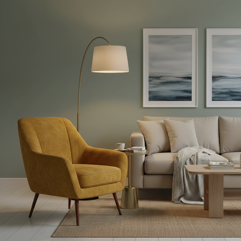
Every sage green living room benefits from at least one moment of deliberate warmth, and a statement armchair in mustard yellow or warm ochre delivers exactly that. Mustard and sage are classic counterparts in the natural world — think of the yellow-green spectrum of an autumn field at dusk — and in interior design they resolve with the same ease because both carry the same low saturation and earthy warmth that prevents clashing. The mustard armchair should be a genuine focal point: place it at an angle to the room rather than flush against a wall, pair it with a small brass or dark wood side table and a floor lamp that creates a defined pool of warm light.
Let it be the only piece in that colour — one statement piece carries more visual weight than five matching items and looks more considered. Choose a shapely silhouette: a rounded tub chair, a buttoned slipper chair, or a low flared-arm club form that adds visual softness against the linear quality of a sage green wall. In a room that is otherwise calm and restrained — linen sofas, neutral rugs, muted accessories — this single warm accent functions as the room’s pulse, the point where the eye returns every time it wanders. It is the kind of choice that makes visitors ask about the chair specifically, which is always the mark of a piece that is doing its job well.
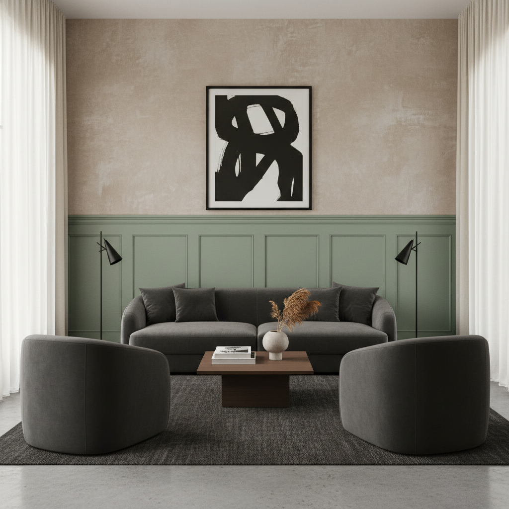
For a living room that leans more architectural and quietly masculine, combining sage green with deep charcoal grey and raw plaster textures creates a palette of extraordinary depth and material honesty. The sage green might appear as a painted wainscot panel or as a feature wall in a chalky, slightly rough finish, while the charcoal appears in upholstery — a large sofa, a pair of compact armchairs — and possibly on a painted ceiling that dips the room into a contained, deliberate atmosphere rather than an expansive one. Raw plaster, either applied as a specialist finish or simulated through a high-quality Venetian plaster paint, bridges the two colours naturally: it shares the grey of the charcoal and the green-grey of the sage, sitting neutrally between them while adding enormous textural interest.
This scheme draws from a brutalist-adjacent design movement — exposed, honest materials in complex tonal ranges, nothing superfluous. It works best in rooms with high ceilings and considered, spare furniture: one or two significant pieces rather than many. A large-scale sculptural ceramic in a stone or ochre tone, a single oversized artwork in black and white with a thin black frame, a woven wool rug in deep charcoal or dark stone. The absence of conventional decorative accessories is what makes the room feel expensive and deliberate rather than incomplete. This is a living room for people who find layered maximalist spaces exhausting — an interior that breathes.
The combination of sage green walls, a crisp white ceiling, and a dark stained wood floor creates a room with a strong vertical reading: the eye is drawn upward by the contrast between the warm dark floor and the lighter wall and ceiling above. This vertical movement makes rooms feel taller and more generous than their measurements would suggest. Layer a vintage rug — a faded Turkish kilim, a worn Persian in dusty rose and navy, or a large Beni Ourain in cream and grey — over the dark floor and the room immediately gains soul, history, and the sense of having been lived in by people who cared about beautiful objects.
The sage green wall unites the deliberate formality of a white ceiling with the organic unpredictability of a vintage rug, sitting between the two as a mediating, calming tone. This is a scheme that rewards real pieces over reproductions: a side table with visible patina, a floor lamp with a slightly imperfect silk shade, a sofa that has been properly sat in. The imperfections make the sage green feel honest rather than showroom-fresh. If you are building a cozy neutral living room from scratch, adding sage green walls with this kind of layered floor treatment is the single quickest way to give the space character and warmth simultaneously. Aim for a vintage rug of at least 200×300cm so the main seating furniture can sit on or near it, grounding the arrangement rather than leaving it adrift on an expanse of dark wood.
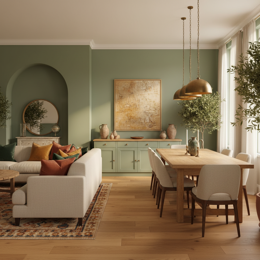
In open-plan homes where the living room bleeds into a dining zone or kitchen, sage green creates an unusually effective transitional colour — one that reads with slightly different character in each space without requiring a jarring colour change at the invisible boundary between zones. Carry sage green on the living room’s feature wall or panel zone and then allow it to reappear in the dining area through a painted sideboard, a set of upholstered dining chairs, or a statement pendant shade. The shared colour creates a visual thread that connects the spaces while still allowing each zone its own furniture scale and lighting character.
In the transition zone — often a dining table positioned between the two areas — introduce a pendant light in aged brass or smoked glass to act as a pivot between the cooler sage reading of the living space and the warmer kitchen beyond. This approach to colour zoning prevents a multi-purpose room from feeling disjointed: the sage green is not a feature wall but a recurring note, appearing at different scales and in different materials as you move through the plan. For open-plan spaces that feel undefined or overly large, sage green used this way acts as a quiet organising principle — bringing cohesion without walls.
Sage green’s enduring appeal lies in its refusal to be a trend. It is a colour rooted in the natural world — in lichen, in eucalyptus leaves, in the patina of weathered copper — which means it ages alongside a room rather than dating it. Whether you were most drawn to the layered texture of limewash walls in idea one, the architectural confidence of full-height panelling in idea two, or the quiet warmth of a statement mustard armchair against a sage backdrop in idea fifteen, the common thread across all of these rooms is restraint: letting the colour do its work without overloading it with competing ideas.
Try one this weekend — a sage velvet cushion ordered on a returnable sample basis, a test pot on a single wall, or a pair of sage linen curtains hung over your current window. The best living rooms grow slowly and deliberately, and sage green is a colour patient enough to grow with you. Save your favourite combinations from this list and return to them as you build the room over time — the ideas that still feel right in three weeks are the ones worth committing to.
Let’s Build
Contact us todayGet daily tips and tricks for making your best home.
2025 Green to Gorgeous