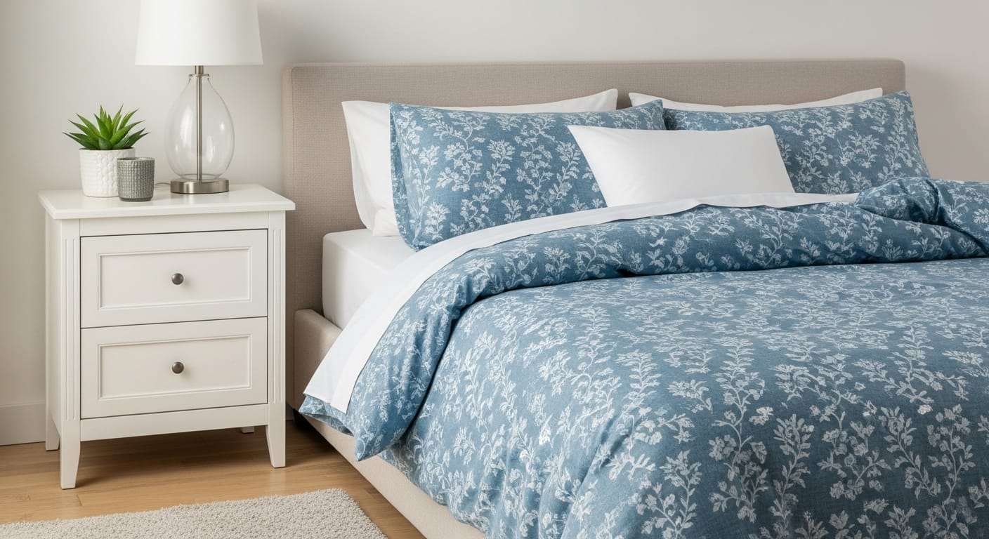
Few experiences rival the quiet luxury of sinking into a perfectly made bed after a long, demanding day. The soft rustle of fresh sheets, the gentle weight of a cozy duvet, the subtle scent of linen in the air — it’s a simple ritual that feels like a reward. Yet, what truly gives a bed its soul isn’t just the high thread count or the plushness of the mattress; it’s the artful layering of color, pattern, and texture that turns an ordinary bed into a masterpiece.
Your bedding is more than fabric — it’s the heart of your bedroom’s story, where comfort meets creativity. Every fold, every hue, every texture whispers something about who you are and how you rest. When you begin to mix and match your sheets, you open the door to self-expression beyond the limitations of matching sets.
Suddenly, your bed becomes a reflection of mood and imagination — a living, breathing canvas that changes with the seasons or even your state of mind.With just a few thoughtful swaps, your space can shift from a calm, spa-like retreat to a vibrant bohemian escape, or perhaps a serene minimalist sanctuary where simplicity reigns.
Whether you find comfort in quiet tonal harmony or delight in a clash of lively prints, these 21 mix-and-match sheet ideas are here to spark your creativity, helping you layer your bed like a designer and, more importantly, create a space that welcomes you home — night after night.
Whether you favor tonal serenity or vibrant chaos, these 21 mix-and-match sheet ideas aim to inspire you to style your bed as a professional designer would and to experience restful sleep.
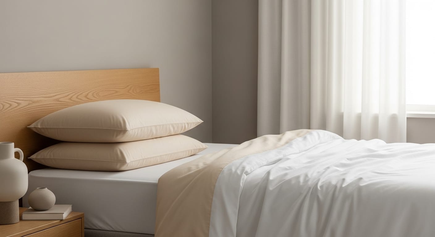
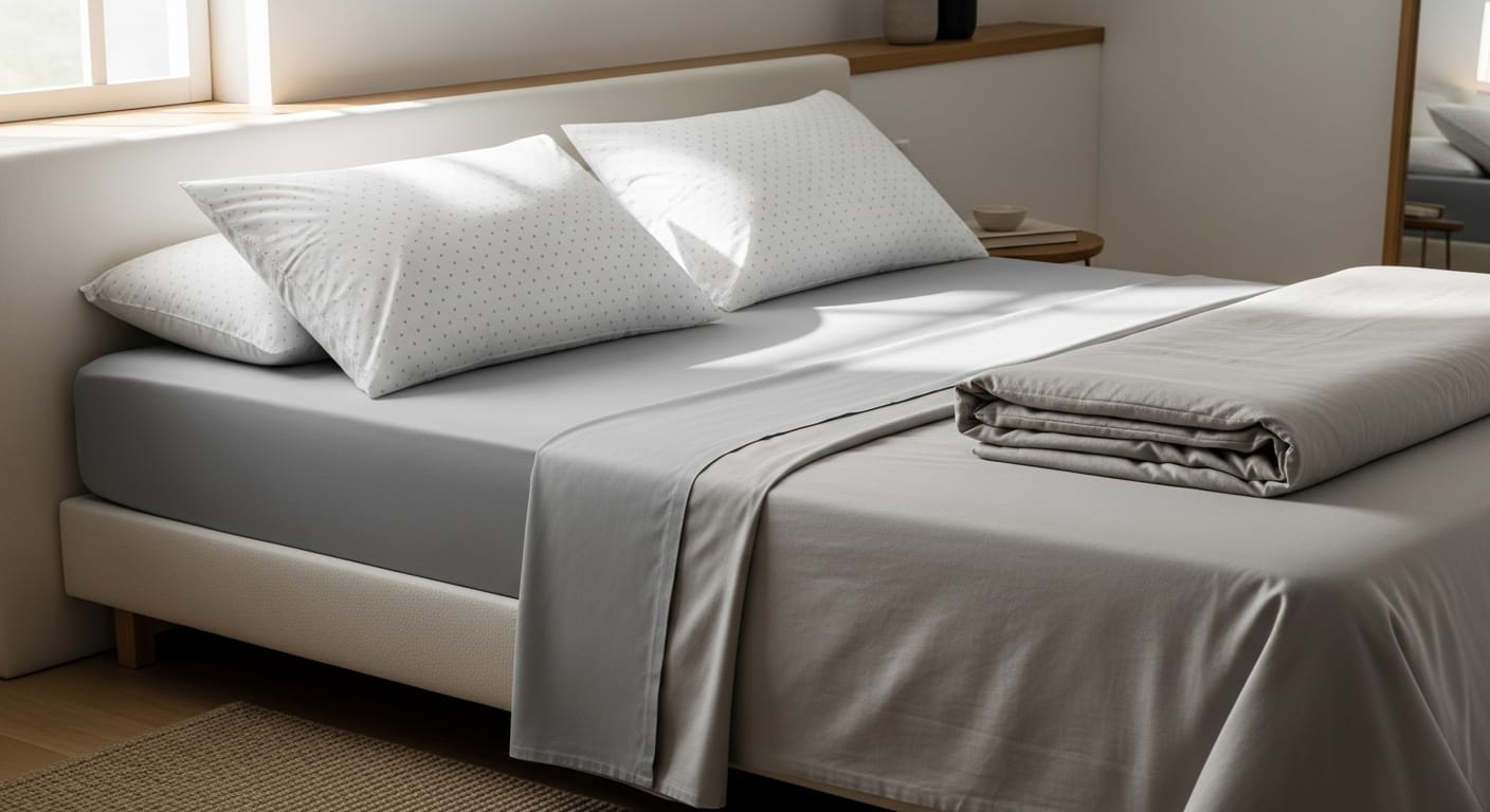
Every stunning bedding setup begins with a calm foundation — your neutral base. Think of it as the blank canvas that lets every other layer shine. Shades like white, cream, light gray, and soft beige bring an effortless sense of serenity to your space while giving you complete freedom to experiment with color, pattern, and texture.
Neutrals have a timeless quality — they never go out of style and blend beautifully with any decor theme, from modern minimalism to cozy cottage charm. The beauty of a neutral foundation is its adaptability: with just a few swaps, your bed can transform with the seasons or your mood.
A crisp white cotton sheet setting the stage in spring, accented by blush or sage pillowcases for a fresh, airy feel. As autumn arrives, switch to mustard or terracotta accents for warmth; then, in winter, drape on deep navy or charcoal layers for a cozy, sophisticated vibe. One base — endless possibilities.
When choosing your fabric, let your lifestyle lead the way. For a relaxed, lived-in elegance, linen is your best friend — slightly rumpled, breathable, and effortlessly chic. And if you love a soft, silky finish that feels indulgent against your skin, try sateen, which brings a touch of quiet luxury.
A well-chosen neutral base doesn’t just make styling easier — it creates a calming backdrop that invites rest, balances your space, and sets the tone for every creative mix-and-match combination to come.
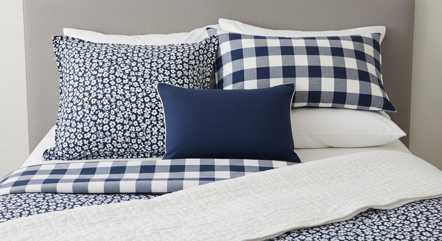
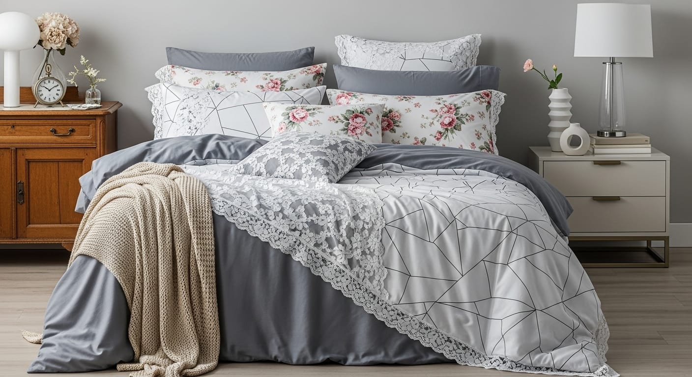
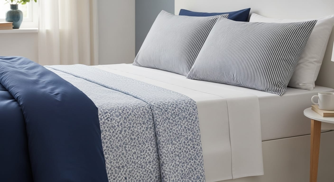
Mixing patterns might sound risky, but when done right, it’s pure magic. Pairing stripes with florals or plaids with polka dots adds rhythm and character. The trick is to ensure there’s a shared color or tone between them. It’s where creativity truly comes alive, transforming your bed from predictable to personality-packed.
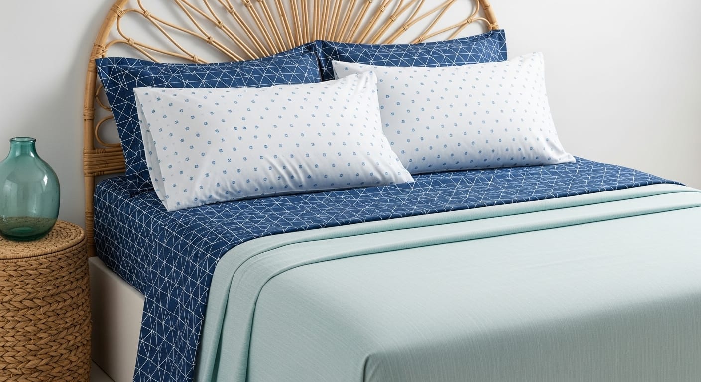
Imagine crisp navy-and-white striped sheets topped with delicate white floral pillowcases. The navy acts as your anchor, grounding the look, while the floral pattern adds softness and a touch of romance. The combination feels both structured and inviting — tailored yet whimsical.The consistent navy keeps the look cohesive, while the floral softens the stripes’ rigidity. If you’re layering multiple prints, let one take the spotlight and let the others whisper in the background.
A bold duvet with oversized patterns pairs beautifully with smaller, more intricate designs on your sheets or pillowcases. This contrast keeps the eye moving and adds a sense of dimension without overwhelming the space.Keep one print bold and the other subtle. If your duvet has large patterns, go smaller on the sheets for visual balance.
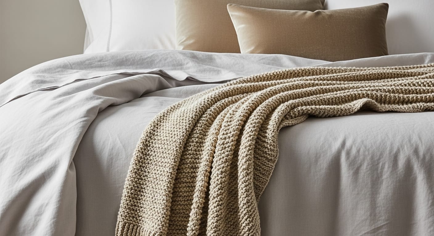
Texture is where bedding transforms from simply functional to irresistibly luxurious. A mix of materials invites touch and creates visual layers that feel cozy and inviting. It’s the secret ingredient that adds warmth, dimension, and visual richness — even when your color palette is minimal. A thoughtfully layered mix of fabrics invites touch, catches the light in different ways, and gives your bed that “can’t-wait-to-curl-up” feeling.
Imagine sliding into crisp cotton sheets that feel freshly pressed, topped with a soft linen flat sheet that brings a hint of rustic charm. Now drape a chunky knit throw casually over the corner of the bed — not perfectly folded, but effortlessly inviting. A pair of velvet or silk accent pillows adds just the right amount of sheen and contrast, making the whole setup feel elevated yet approachable. Texture variation works especially well in neutral or monochrome palettes—it adds visual interest without relying on color.
This interplay of smooth, coarse, and plush textures doesn’t just look stunning — it feels indulgent. It transforms your bed into a sensory experience that whispers comfort and calm.
Texture layering shines brightest in neutral or monochromatic spaces. When you’re not relying on color, the tactile details — the weave of linen, the fluff of knit, the gloss of satin — become the stars of the show. The result is depth, warmth, and a bed that feels as good as it looks.
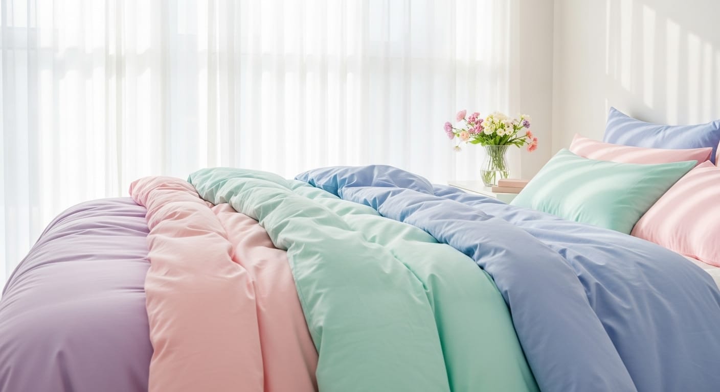
Tonal layering creates harmony without monotony. Instead of jumping from one color to another, explore different shades of the same hue. One of the most refined ways to create harmony in your bedding without ever feeling flat or repetitive. Instead of switching abruptly from one color to another, it invites you to explore the subtle nuances within a single hue — allowing depth, warmth, and sophistication to unfold naturally.
Imagine a serene gradient drawn from nature itself: the pale blue of an early morning sky melting into dusty teal, then deepening into a rich navy as night approaches. When translated into bedding, these layered tones create a peaceful, spa-like ambiance that feels curated yet effortless.
For a softer, more romantic direction, consider this combination: a pale blush fitted sheet, dusty rose flat sheet, and deep mauve duvet. Together, they create a beautifully cohesive spectrum that feels both feminine and calming.
Sometimes all your bed needs is one bold pop to make it sing. Introduce a single statement color amid soft neutrals .The simplest way to transform your bedding is by introducing a single, striking accent color that instantly draws the eye. A well-placed pop of hue can elevate an otherwise neutral setup, adding vibrancy and personality without disrupting its harmony.
Think of layering a bold mustard yellow, emerald green, or terracotta red element—such as a top sheet, throw, or pillowcase—against a backdrop of crisp white or soft beige linens. For example, a burnt orange top sheet paired with pure white bedding infuses the space with warmth, depth, and a subtle sense of sophistication.
To achieve the perfect visual balance, follow the classic “60-30-10” design principle. 60% of your bedding should remain neutral, forming the calming foundation.30% introduces a complementary secondary color for gentle contrast.10% features your accent pop — the bold hue that makes the entire look sing. This thoughtful layering of color not only adds visual interest but also creates a bed that feels intentional, inviting, and full of character.
If you’re not ready to mix completely different colors, stay within one color family. Play with varying shades of blue — navy stripes, sky blue polka dots, and a soft aqua solid top sheet.
Because the hues are connected, the overall effect is sophisticated rather than chaotic.
This technique allows you to explore depth and variation without overwhelming the space. It creates a balanced, harmonious composition. Start with a pale seafoam fitted sheet featuring delicate linear details to set a soft foundation. Layer it with a deep navy geometric top sheet that introduces structure and visual interest. Then, complete the look with crisp white pillowcases adorned with tiny blue motifs, tying the palette together with subtle elegance.
The result is a layered, coastal-inspired look that feels fresh, cohesive, and inviting — a perfect blend of serenity and sophistication. This tonal harmony evokes the calm rhythm of ocean waves, bringing both depth and tranquility to your bedding design. A layered coastal vibe that feels cohesive and breezy.
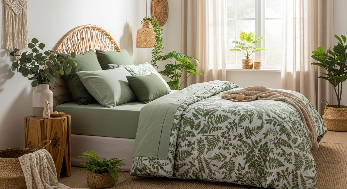
Infuse your space with the serene charm of nature by embracing botanical-inspired bedding. Think leafy prints, subtle florals, and forest-toned layers that create an atmosphere of calm and renewal. Start with a soft sage fitted sheet as your foundation, add moss-green pillowcases for depth, and finish with a fern-patterned duvet to capture the essence of a peaceful woodland retreat.
Enhance the organic feel with rattan accents, woven baskets, or natural wooden bedside pieces—elements that bring texture and warmth to the look. For an extra touch of freshness, add a few potted plants or eucalyptus stems to tie the entire design together, turning your bedroom into a soothing, nature-inspired sanctuary.Add rattan or wooden decor to reinforce the natural vibe.
Transform your bedroom with the rhythm of the seasons by rotating your sheets to match the mood and temperature of the year. This simple change keeps your space feeling intentional, inviting, and attuned to nature’s flow.
Spring: As the air turns crisp and fresh, lighten your bed with breathable cotton sheets in soothing pastel shades such as mint, lilac, or blush. These colors evoke renewal and complement the soft light of early mornings.
Summer: When temperatures rise, switch to linen or bamboo sheets in airy hues like white, sand, or pale blue. These natural fibers wick away moisture, keeping your sleep environment cool and breezy.
Autumn: As the leaves deepen in tone, so should your bedding. Opt for brushed cotton or sateen sheets in warm, earthy colors—think rust, amber, or olive. The cozy textures and rich palette echo the season’s comfort.
Winter: Embrace the chill with plush flannel or jersey sheets in deeper tones such as plum, charcoal, or burgundy. These materials trap warmth and create a cocoon-like feel, perfect for long nights and lazy mornings.
Refreshing your bedding each season doesn’t just elevate your décor—it enhances comfort, aligns your space with the time of year, and helps you fall in love with your bedroom all over again.Changing colors and fabrics not only refreshes your look but also improves comfort throughout the year.
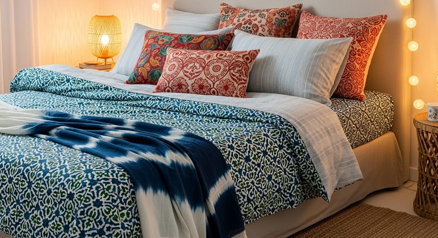
Bedding inspired by world cultures adds depth, soul, and storytelling to your space. Mix Moroccan tile prints with minimalist Nordic stripes, or combine Japanese shibori-inspired sheets with Indian block prints.
This layered global aesthetic feels curated and worldly — like a collection of memories gathered over time.
Anchor your mix with one neutral tone (like beige or white) to keep the look grounded.
Bring a touch of wanderlust to your bedroom by blending patterns inspired by cultures around the world. Global prints infuse your bedding with character, history, and an effortlessly curated look that feels both personal and worldly.
Think of pairing Moroccan tile motifs—rich with intricate geometry—with Scandinavian stripes for a striking balance between ornate and minimalist. Or combine Japanese shibori-dyed sheets with Indian hand-block prints to create a layered narrative that celebrates craftsmanship and culture.
This mix tells a visual story—one that evokes travel, art, and the beauty of diversity. It’s like sleeping within a gallery of your favorite global inspirations. To keep the look cohesive, anchor your patterns with a neutral base such as ivory, beige, or warm gray. These grounding tones prevent visual overload while allowing each pattern’s unique charm to shine through gracefully.
Finish the ensemble with natural materials—woven throws, rattan accents, or textured linen cushions—to reinforce the worldly, well-traveled aesthetic while maintaining comfort and harmony.
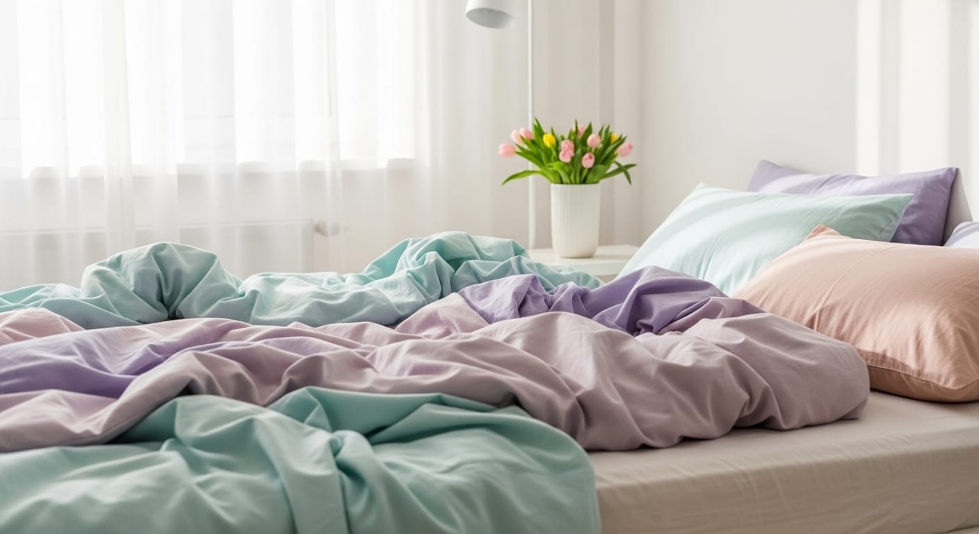
Transform your bedroom into a serene retreat with the soft elegance of pastel tones. Think pale lilac, blush pink, mint green, or powder blue — hues that whisper calm rather than shout for attention. When layered together, these gentle shades create a balanced, airy atmosphere that soothes the senses while adding subtle visual interest.
Complement your pastel bedding with sheer white curtains that diffuse natural light beautifully, and finish the look with a vase of fresh blooms on your nightstand to evoke a romantic, effortlessly refreshing charm.
If you’re hesitant to dive straight into bold patterns, this approach offers the perfect balance of simplicity and sophistication. Begin with solid-colored sheets as your foundation — they serve as a calm visual base that anchors the entire look. Then, gently introduce subtle patterns such as micro-dots, miniature florals, fine pinstripes, or delicate herringbone weaves. These understated designs create just the right amount of visual intrigue without overwhelming the space.
Imagine a bed dressed in smooth dove-gray sheets paired with crisp white pillowcases adorned with faint, tonal polka dots. The effect is timeless and elegant — polished enough for a refined aesthetic, yet relaxed enough for everyday comfort.
Subtle prints function almost like texture. They catch the light softly, adding depth and dimension while maintaining a sense of harmony. This approach is ideal for anyone who appreciates a clean, modern style but still wants their bedding to feel curated, layered, and intentionally designed.
The bold division of color creates visual energy, while repetition of tones ensures harmony.
Styling Insight: Stick to clean lines and avoid patterns to let the colors speak for themselves.
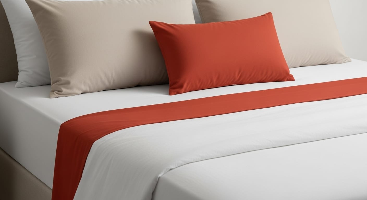
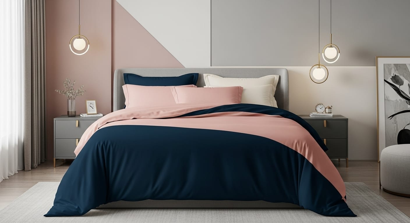
Color blocking is one of the most striking yet refined ways to give your bedding a polished, editorial feel. Instead of relying on patterns or prints, this approach celebrates pure color—bold, confident, and purposeful. It’s the art of pairing contrasting yet harmonious shades to create a clean, modern composition that looks thoughtfully curated.
Begin by selecting two to three complementary hues that reflect the mood you want to create. For a calm, sophisticated atmosphere, pair muted tones like midnight blue, soft blush, and warm cream. For a more dramatic statement, try charcoal gray, mustard yellow, and ivory.
Example Combination:
This layered contrast of tones establishes visual rhythm and elegance without feeling busy. The result is clean, structured, and effortlessly stylish—a look you might see in a boutique hotel or interior design magazine.
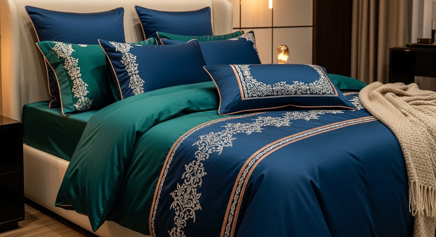
Metallic touches bring instant glam to any bedding design. Elevate your bedding with the subtle sophistication of metallic details. A touch of shimmer—whether through gold-embroidered pillow edges, silver-thread motifs, or refined copper piping—instantly adds a sense of luxury and visual intrigue. Metallic elements catch and reflect ambient light, creating an elegant interplay of sparkle and softness that transforms your bed into a statement of refined style.
For a bold, opulent look, pair metallic accents with deep jewel tones such as emerald, sapphire, or ruby. These rich hues enhance the luster of metallic threads, evoking a sense of grandeur and depth. Prefer something more serene? Opt for soft pairings like champagne, ivory, or pearl gray—perfect for achieving a calm, contemporary elegance.
When the evening light hits your bedding, metallic weaves shimmer subtly, casting a warm, inviting glow that feels both intimate and indulgent. The result is a bed that doesn’t just look beautiful—it glows with quiet confidence and timeless sophistication
Blending design eras adds timeless character and depth to your bedroom. When done with intention, it creates a space that feels both nostalgic and fresh — a perfect harmony between heritage and modern sophistication.Consider pairing vintage floral pillowcases or delicately lace-trimmed sheets with a sleek geometric or minimalist duvet. The contrast of old-world charm against modern structure tells a story — one of personality, history, and thoughtful curation.
To keep the look cohesive, unite the pieces through color. A soft antique rose tone powerfully complements cool modern grays, creating a palette that effortlessly bridges the gap between past and present. A vintage embroidered pillowcase layered beside a contemporary herringbone throw brings tactile richness and visual balance — evoking comfort, style, and an effortlessly lived-in elegance that never goes out of fashion.
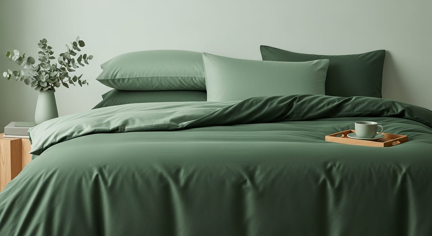
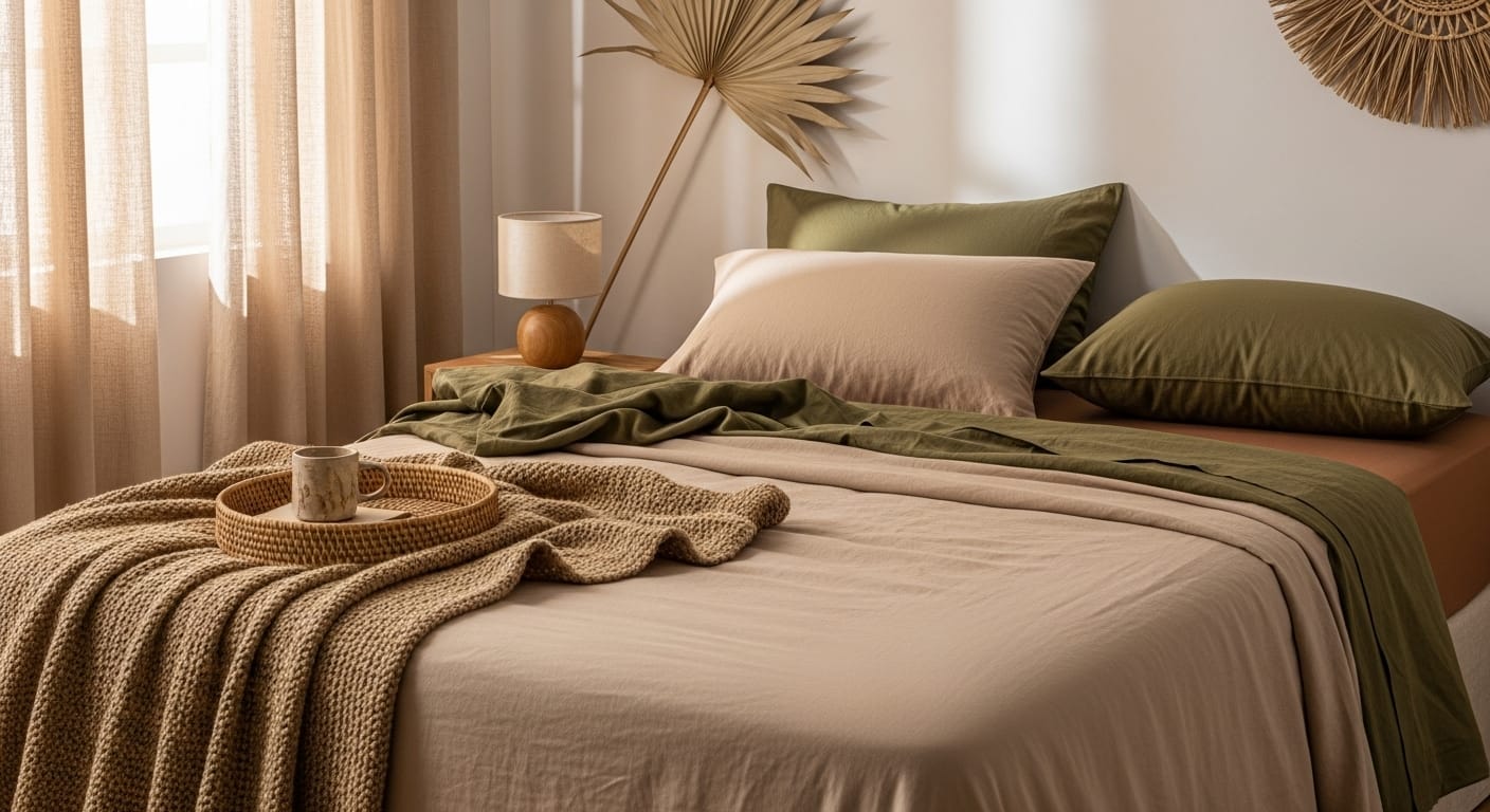
Bring the serenity of nature indoors with grounding colors and tactile fabrics.
Think sand, clay, olive, and cream — the tones of earth and stone. Linen sheets in these hues feel effortlessly relaxed and sophisticated. Earth tones soothe the mind and create an environment of calm restoration.
Invite the quiet beauty of the outdoors into your bedroom with colors that whisper tranquility and fabrics that beg to be touched. Think of the soft, grounding palette nature offers—sun-baked sand, weathered clay, silvery olive leaves, and creamy stone. These tones feel organic, timeless, and soothing to the senses.
Start by layering a beige fitted sheet as your foundation, then drape a clay-toned top sheet to add gentle warmth. Finish with olive pillowcases that echo the serenity of a forest canopy. To deepen the natural charm, accent your bedding with a woven jute throw, a rattan tray, or a wood-grain bedside lamp—small touches that bring texture and authenticity to the space.
Earthy tones work like a slow exhale. They quiet the mind, soften harsh edges, and wrap your bedroom in calm restoration. When paired with natural fabrics like linen or cotton, they don’t just look serene—they feel it, turning your bed into a sanctuary that reflects the grounding rhythm of nature itself.
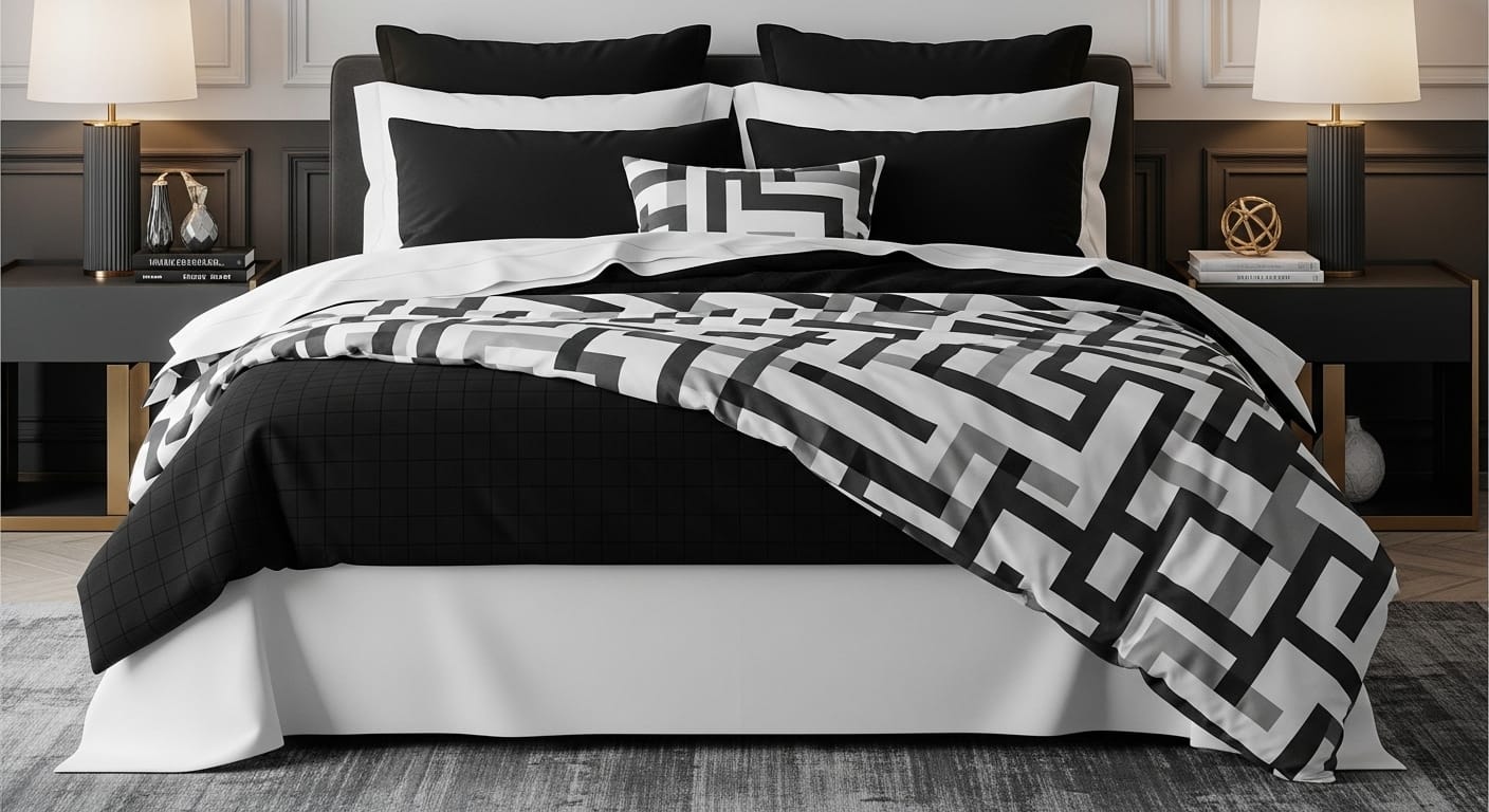
Classic. Dramatic. Always in style. Classic black and white bedding has a way of commanding attention while remaining effortlessly sophisticated. This timeless pairing transcends trends, creating a look that’s both grounding and glamorous.
Start with crisp white sheets as your foundation and layer on subtle black grid prints or pinstripes for texture and visual rhythm. Add contrast with solid black pillowcases or shams to define the edges of your bed, and finish with a patterned duvet — perhaps a bold geometric, houndstooth, or soft brushstroke design — to pull everything together.
For a Touch of Luxury introduce an accent cushion or throw in metallic gold, rich emerald, or deep sapphire. The subtle shimmer against a monochrome base instantly elevates the look from minimal to magnificent.
For a Modern Aesthetic opt for abstract or linear patterns — think minimalist brush lines, contemporary shapes, or asymmetric grids — to add artistic flair. For a Vintage Twist choose delicate polka dots or retro-inspired motifs that bring a hint of nostalgia while keeping the look playful and chic.
Keep the rest of your space clean and understated — soft gray walls, sleek nightstands, or warm wood accents — so your bedding remains the centerpiece. The result is a bedroom that feels composed, confident, and undeniably timeless.
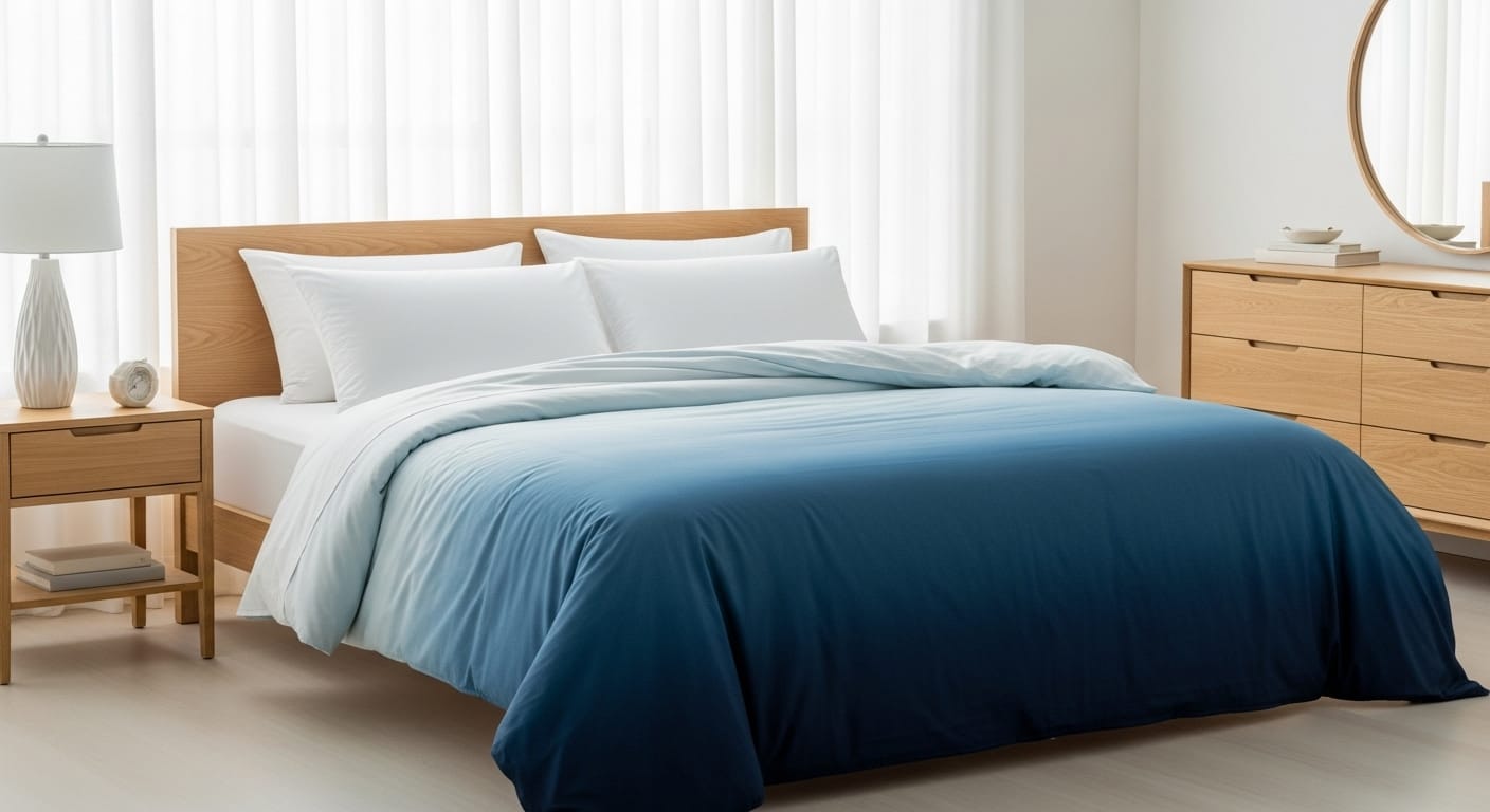
Ombre bedding transitions softly from one shade to another — a dreamy choice for anyone who loves a subtle artistic flair. Ombre is like an art you can sleep in — a gentle river of color that moves effortlessly from light to dark, creating a serene, painterly effect across your bed.
Imagine sheets fading from pale sky blue to deep ocean navy, paired with crisp white pillowcases. The gradual color shift feels peaceful and contemporary. To enhance the look, pair ombre bedding with solid accessories from one end of the gradient.
Instead of harsh contrasts, you get a seamless flow of tones that feels soft, fluid, and endlessly calming.Picture your sheets beginning in a whisper of sky blue at the head of the bed, gradually deepening into tranquil ocean navy toward the foot. Add crisp white pillowcases to frame the gradient, and suddenly your bed becomes a peaceful horizon — like watching dusk melt into night.
To complete the look, anchor your ombre set with solid accessories pulled from one end of the gradient — a navy throw, sky-blue shams, or an accent cushion in between those hues. This repetition builds cohesion and sophistication while keeping the design clean and intentional.
Designer’s Tip: Ombre bedding works beautifully in minimalist, coastal, or modern spaces. Pair it with light wood, sheer curtains, and soft lighting to create a dreamy, spa-like atmosphere that invites deep rest and visual serenity.
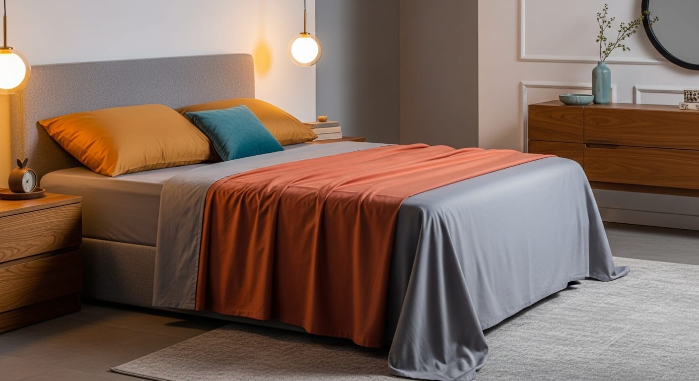
Playing with temperature contrast is one of the most exciting ways to bring depth and emotion into your bedding. Warm tones — like terracotta, rust, and golden mustard — infuse the room with comfort and warmth, wrapping your space in a cozy glow. In contrast, cool shades such as gray, teal, and powder blue evoke calm, clarity, and balance.
When these opposites meet, the result is visually magnetic — a perfect harmony of energy and tranquility. Picture a terracotta top sheet draped over soft gray fitted sheets. The warmth of the clay hue radiates against the serene coolness of gray, creating a look that feels both modern and grounded.
Always let one undertone lead. Choose either warm or cool as your base, then introduce a single contrasting pop to spark interest without chaos.
Think of dressing your bed the same way you’d style a great outfit — start with timeless basics, then build character with standout details. Begin with simple, solid sheets as your foundation, and layer in personality through patterned accents — perhaps a crisp white fitted sheet, a delicate blue floral top sheet, a rich navy duvet, and striped pillowcases to tie it all together.
This mix of solids and prints strikes the perfect balance between calm and creativity, adding dimension and designer flair without ever feeling busy.
This alternation of solid and pattern creates structure, giving your bed depth without clutter.
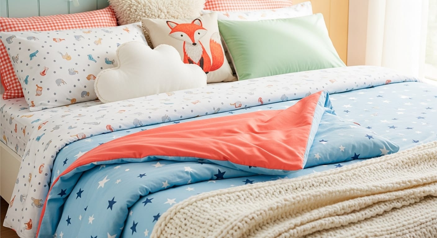
Children’s and guest rooms are perfect for creativity.A spaces where you can have fun with color, pattern, and personality without worrying too much about strict design rules. These rooms thrive on imagination and warmth, and your bedding can set that joyful tone instantly.
Mix bright, cheerful patterns like gingham checks, star prints, polka dots, or even subtle animal motifs. For a cohesive look, keep one visual element consistent — such as staying within a pastel palette (mint, peach, sky blue) for a soft, storybook feel, or using bold primaries (red, yellow, navy) for a more lively, graphic style. The goal is to make it look intentional rather than chaotic.
Choose reversible duvets or layered comforters so you can easily switch up the theme when guests visit or when your child’s interests evolve. A quick flip of the duvet or change of pillowcase can give the entire room a fresh, new personality.
Encourage creativity through bedding that reflects their world — dinosaurs, space, florals, or rainbows — but balance those bold themes with neutral sheets or solid-toned blankets to maintain a sense of harmony. This way, the room still feels playful and stylish, not overwhelming.
Add a tactile element like a knitted blanket or soft quilt at the foot of the bed. Kids love cozy textures, and guests will appreciate the layered comfort that says, Welcome — this space was made for you.
At the end of the day, your bed should tell your story. It’s not just a place to rest — it’s a personal expression of who you are. Whether your style leans toward minimalist monochrome, free-spirited bohemian layers, or a lively mix of colors and prints, let that individuality shine through every fold and fabric.
Don’t hesitate to bend the traditional “design rules.” Mix patterns that bring you joy, layer textures that feel comforting, and experiment until your bedding feels uniquely yours. True style isn’t about uniform perfection — it’s about authenticity, warmth, and how your space makes you feel.
The most beautiful bedding designs aren’t just seen; they’re felt. They reflect comfort, confidence, and creativity. So sleep in style, embrace what feels like home, and let your bed become a daily celebration of you.
Even the most creative bedding combinations need a touch of structure to look cohesive. Follow these guiding principles to ensure your mix of colors, patterns, and textures feels polished, intentional, and design-forward — never chaotic.
Begin with two to four complementary hues and let them guide your choices. This limited palette keeps your look harmonious while giving you enough range to play. Choose one dominant color for your base sheets, a secondary tone for accents, and a pop shade or neutral to tie it all together.
Patterns bring personality, but too many can overwhelm the eye. Treat bold prints as statement pieces — on a pillowcase, top sheet, or throw — and ground them with solid, neutral layers. The contrast between expressive patterns and clean solids creates both energy and restfulness.
Design isn’t only about what you see — it’s also about how it feels. Combine fabrics with different hand-feels and finishes: smooth cotton for crispness, washed linen for relaxed charm, and a soft knit or velvet for warmth and texture. The interplay between materials adds dimension and an inviting, lived-in character.
Repetition builds rhythm and consistency across your bedding. If you introduce a blush pink in your top sheet, echo it in a decorative pillow or throw. This subtle repetition acts like a design thread, guiding the eye and giving your arrangement flow.
Artificial lighting can alter tones dramatically. What looks creamy beige under a lamp may turn yellowish in daylight. Before finalizing your mix, spread your bedding pieces out in natural light to ensure the colors and undertones complement each other in every condition.
By applying these thoughtful guidelines, even daring combinations of prints and hues will look effortlessly curated — transforming your bed into a stylish, cohesive centerpiece rather than a visual experiment gone wrong.
Bedding goes far beyond the function of sheets and comforters. Your bed is more than a piece of furniture — it’s your personal sanctuary, a space where your day begins and ends. The choices you make in fabrics, colors, and layers are not merely decorative; they shape how you feel, rest, and restore yourself. Thoughtfully chosen sheets can elevate your mood, calm your senses, and transform your nightly routine into a quiet act of self-care.
Mixing and matching isn’t just about creating a visually appealing bed — it’s about designing an experience that reflects your personality and nurtures your well-being. Every color you choose, every pattern you layer, and every texture you blend tells a small part of your story.Your bedroom is more than a place to rest — it’s where your energy is renewed and your spirit finds balance.
So, embrace creativity with confidence. Pair that floral print with a subtle stripe, let a touch of velvet soften your linen layers, and discover how these thoughtful combinations can bring new life to your bedroom.
Let’s Build
Contact us todayGet daily tips and tricks for making your best home.
2025 Green to Gorgeous