3 MIN READ
Decor Ideas
Written By
G2G Team
Published
May 22, 2026
What makes a home feel truly inviting before the door even opens? A front porch is the house’s first impression—a transition between public and private that conveys warmth, care, and style. When designed thoughtfully, it becomes more than an entryway; it’s a daily retreat for morning coffee, a greeting space for neighbors, and a quiet perch to watch sunsets.
Unlike trend-driven décor, a timeless porch relies on proportion, texture, and balance—qualities that stay beautiful through every season. Whether your porch is deep and wrap-around or narrow and urban, these 19 front-porch decorating ideas blend classic design principles with lived-in comfort so your home always feels like it’s saying, Welcome home.
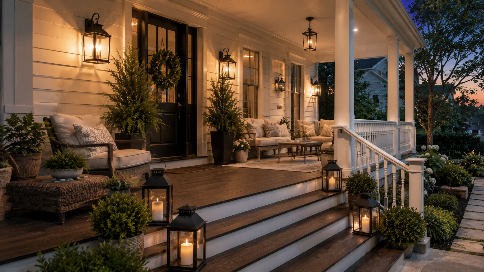
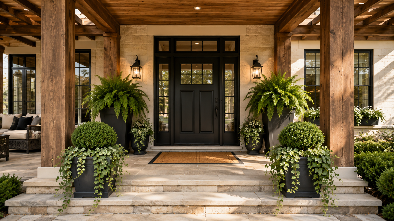
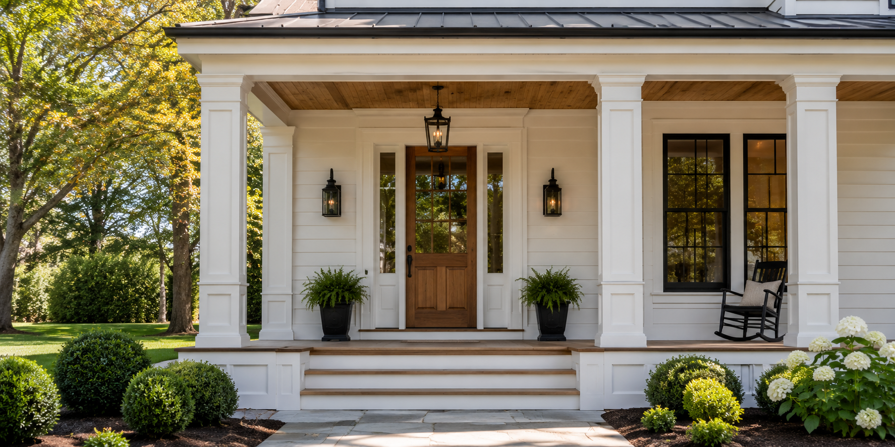
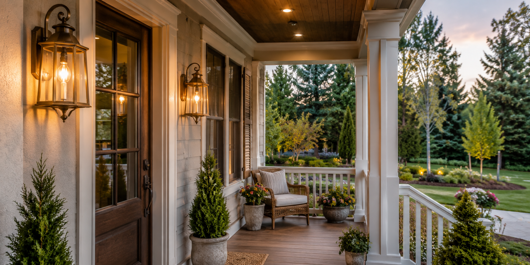
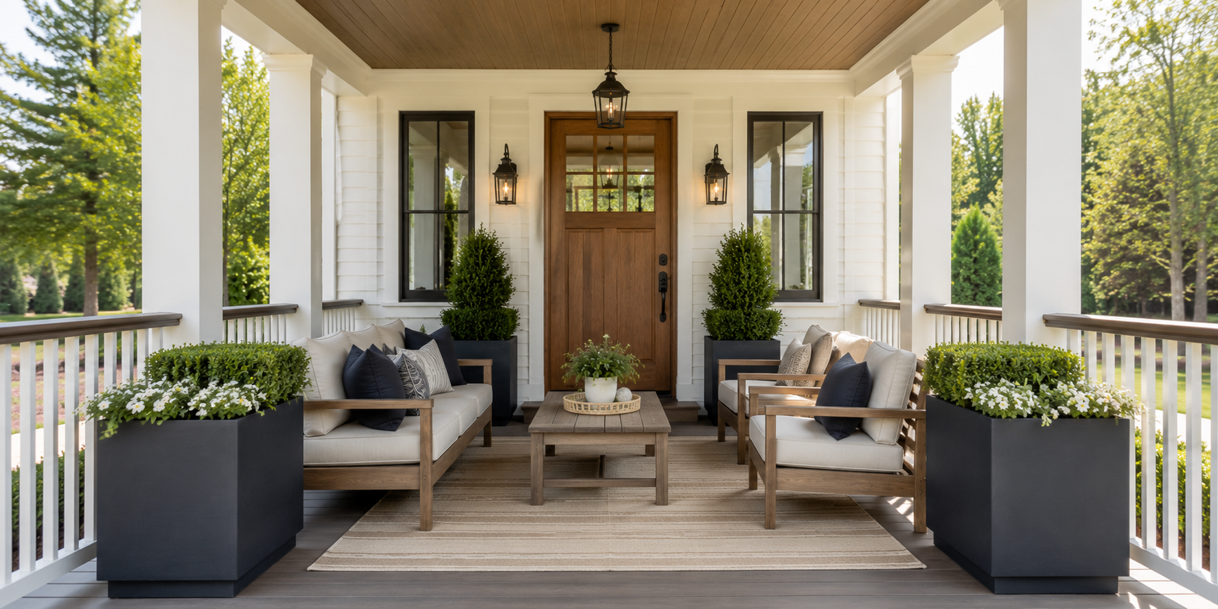
Balance immediately tells guests that a space is well cared for. Place identical lanterns or planters on each side of the door to create visual rhythm. If architecture prevents perfect symmetry, echo weight instead—pair a large potted fern with two smaller accessories across from it. Keep the center line clear so the doorway remains the visual focus.
Even modest porches benefit from this harmony: balanced elements make narrow spaces appear wider and large spaces feel composed. When symmetry feels too formal, loosen the arrangement slightly—stagger heights or materials while maintaining overall equilibrium.
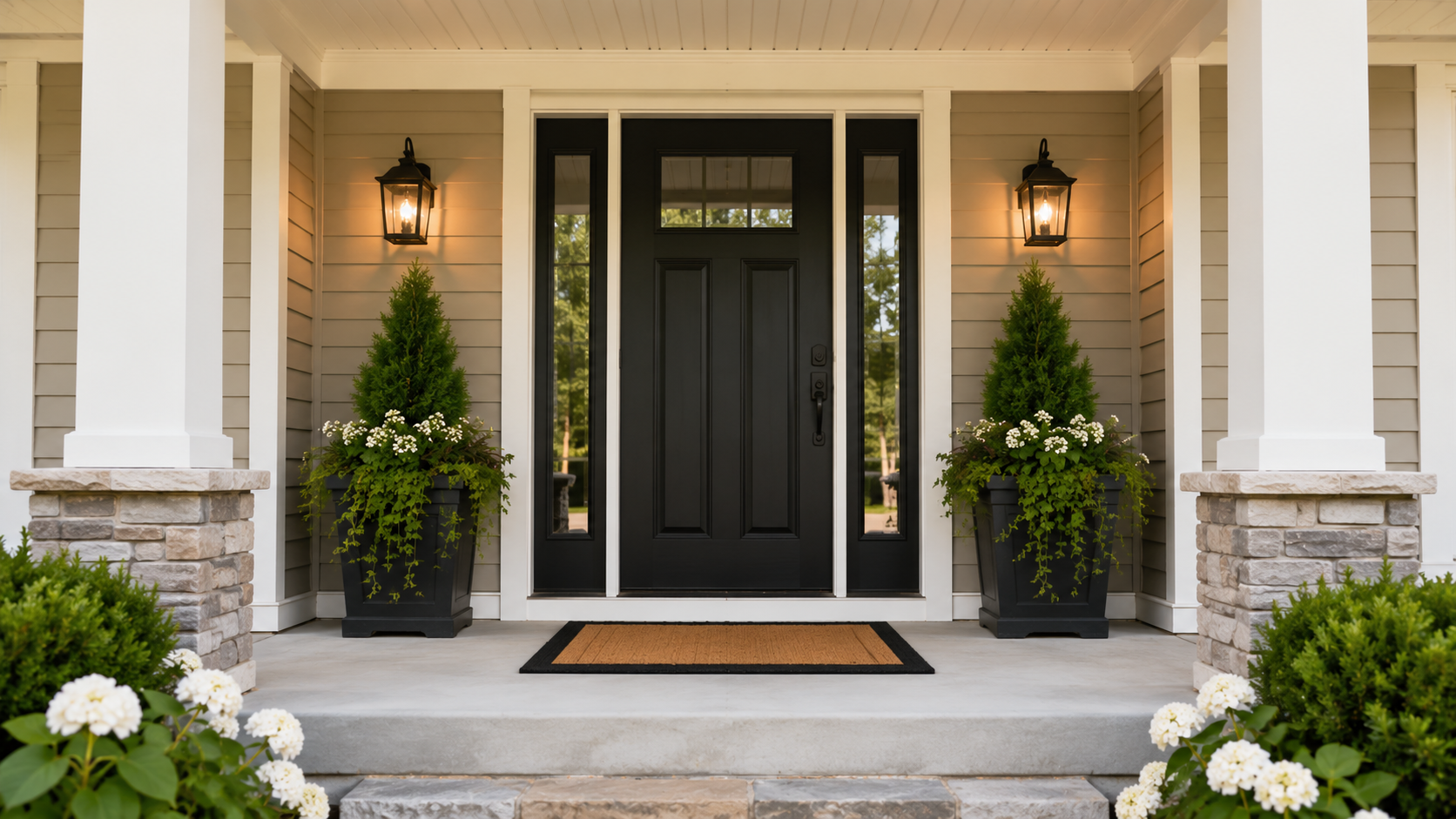
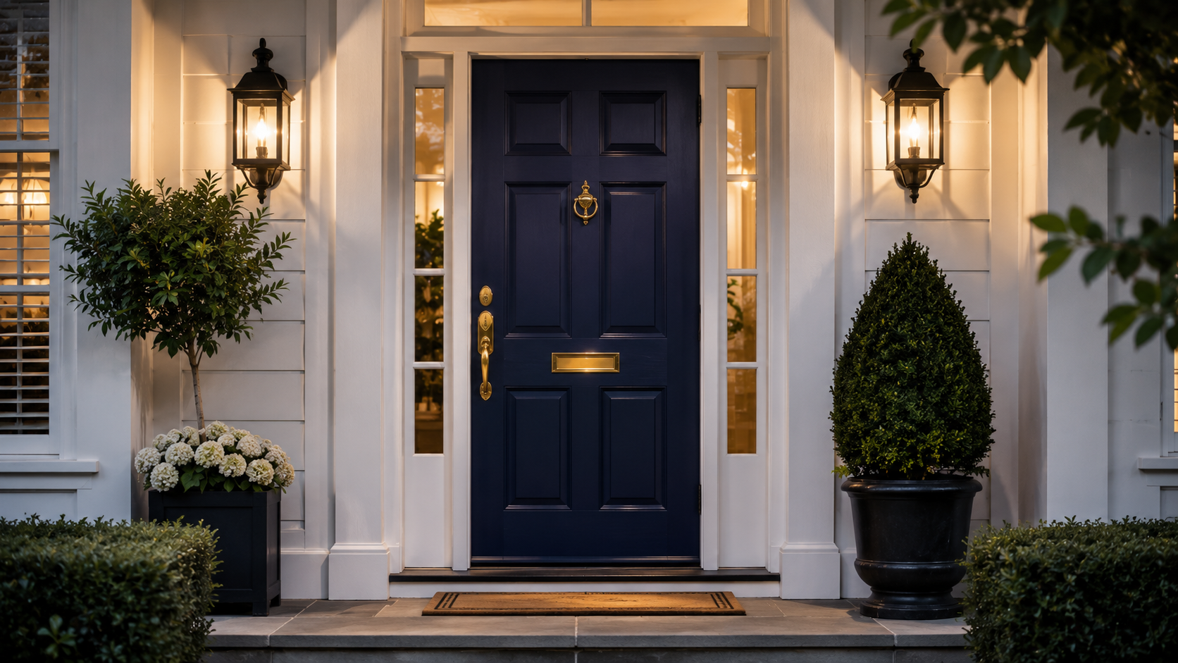
Your front door is both anchor and accent. Paint it a color with timeless depth—navy, forest green, or charcoal—that contrasts gently with surrounding trim. Replace dated hardware with solid brass or matte-black metal and ensure the finish repeats elsewhere, such as on lanterns or railings, for cohesion.
Add a simple natural-fiber mat and a tasteful wreath of greenery or dried stems. At dusk, soft lighting should graze the door to accent wood grain or panel detail. A well-lit, well-finished door becomes the portrait of the home’s personality—confident but never flashy.
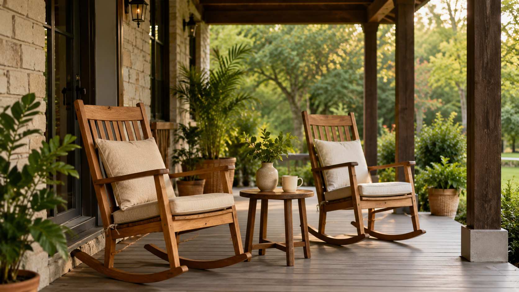
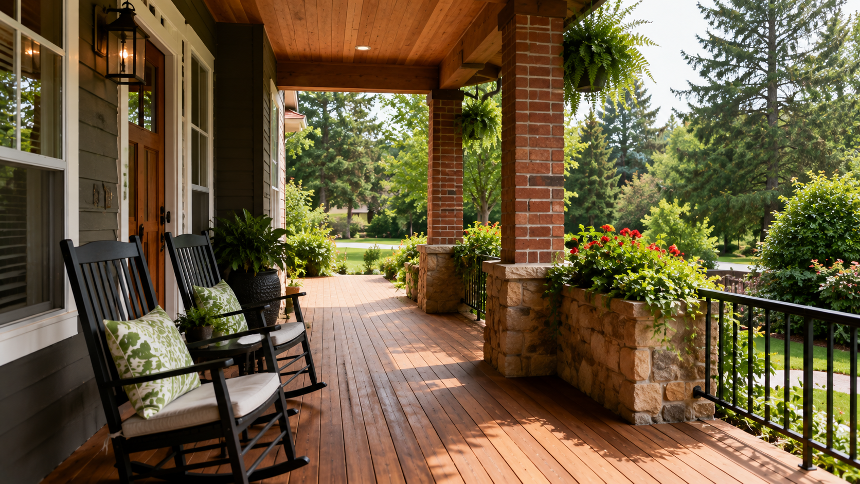
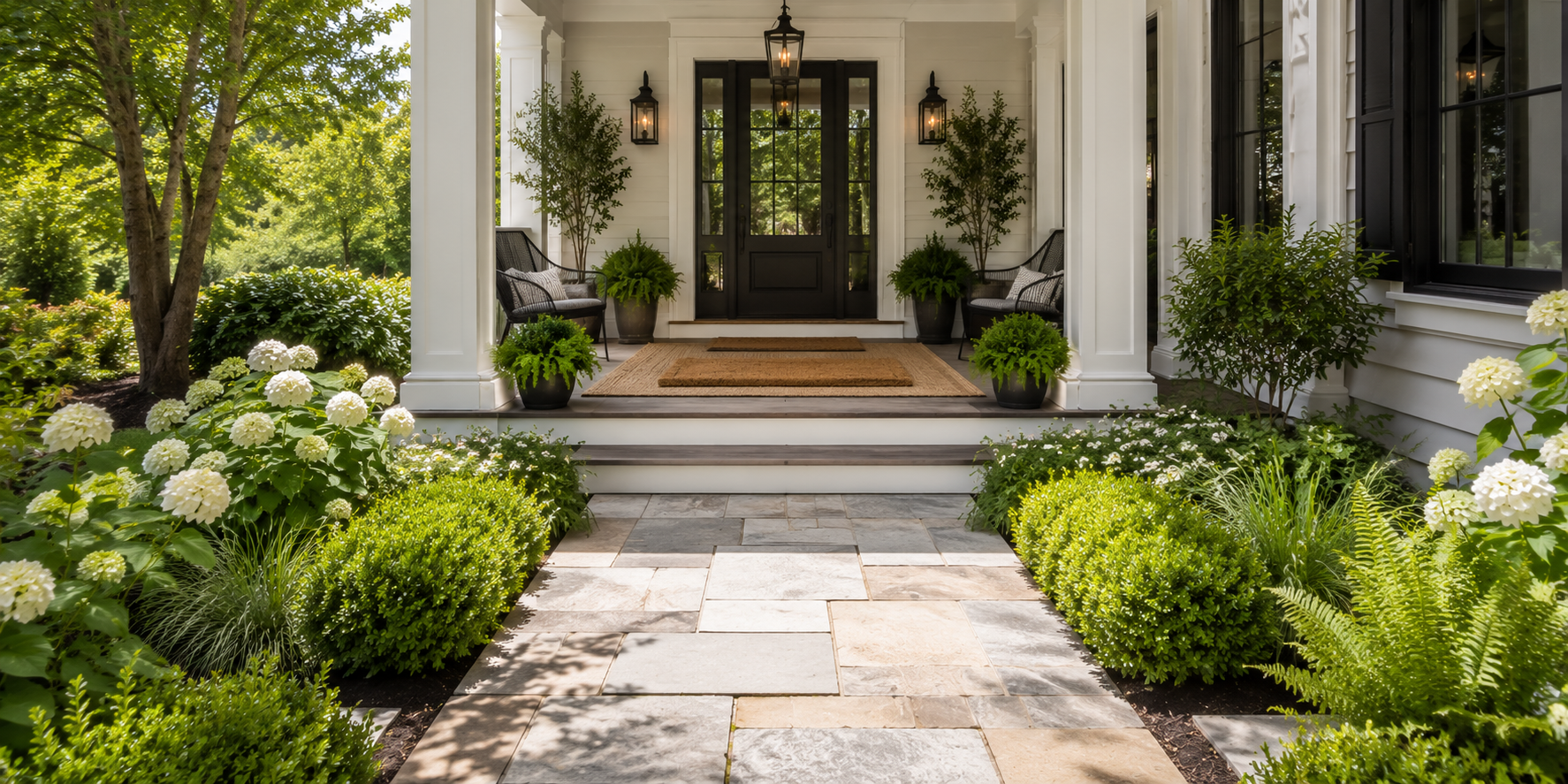
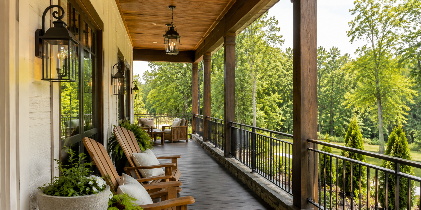
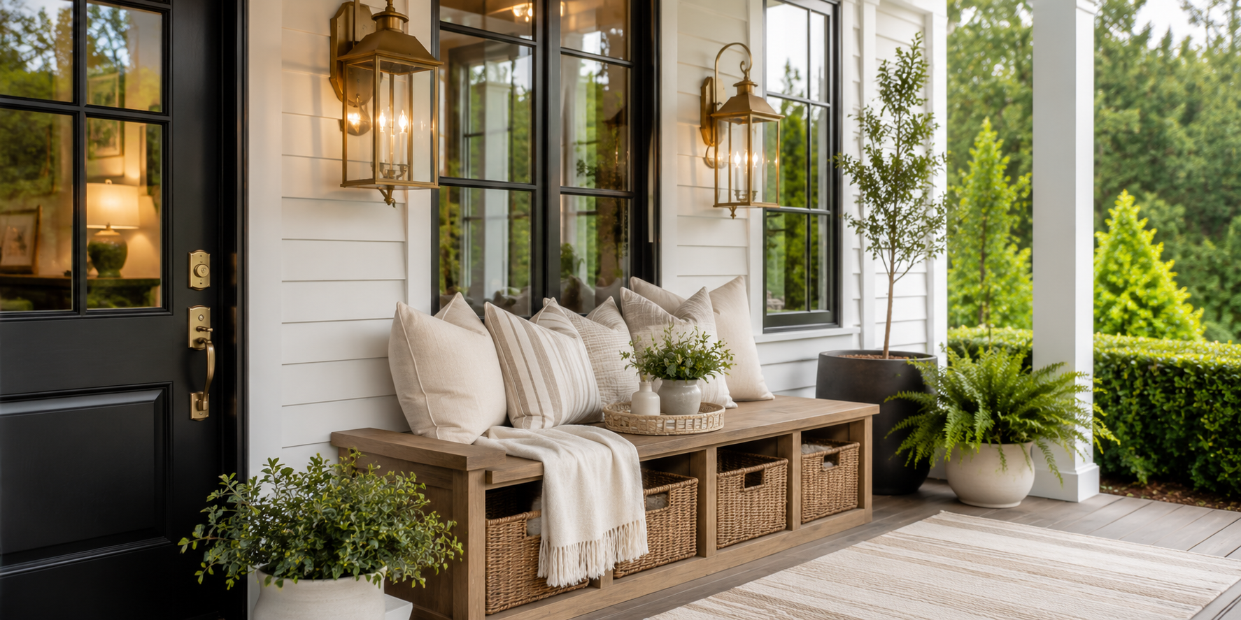
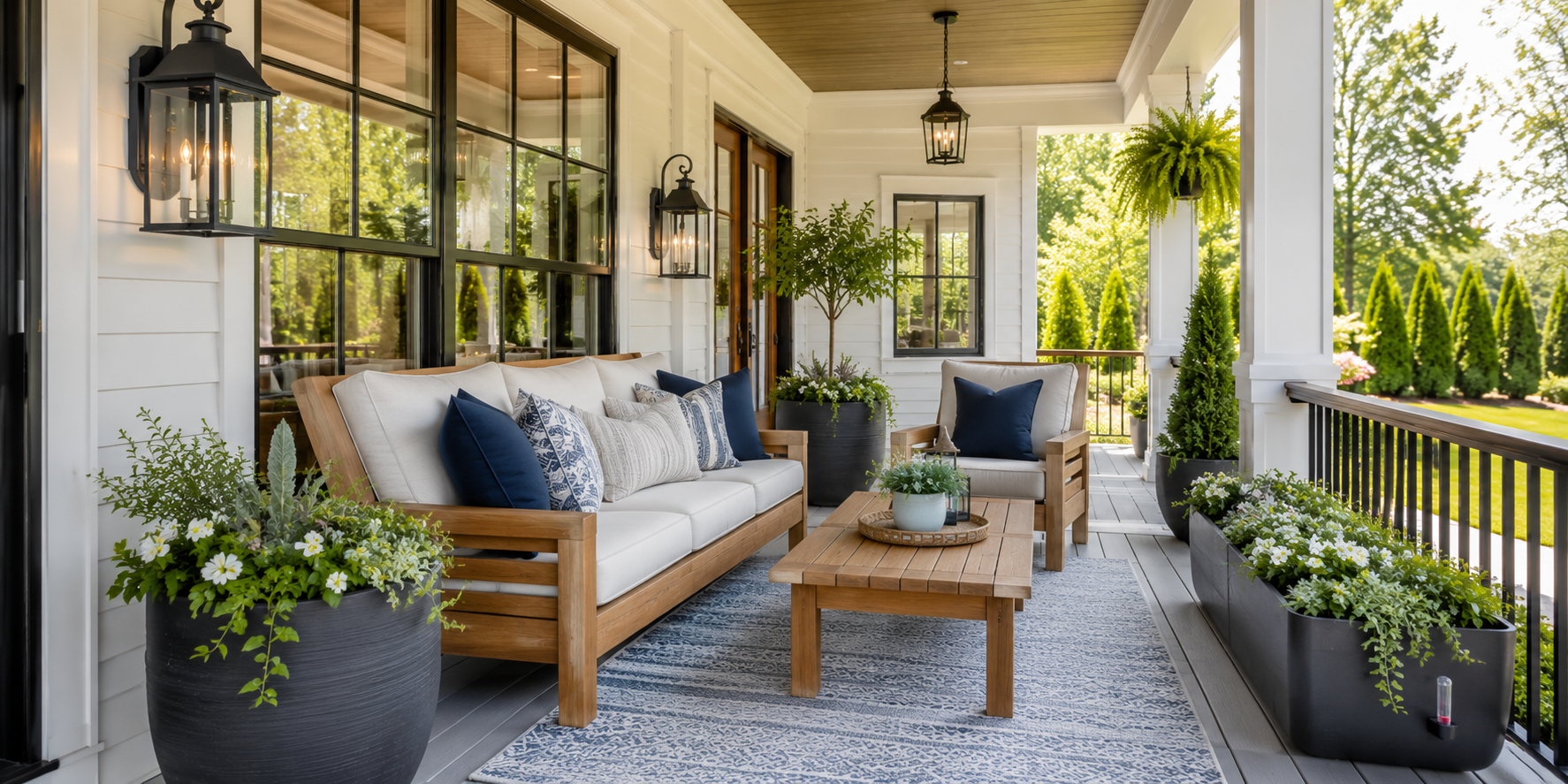
A welcoming porch offers a place to pause. Rocking chairs, a small loveseat, or a suspended swing all convey hospitality. Arrange seating to face outward toward the garden or street; it suggests openness rather than enclosure.
Use sturdy teak or powder-coated metal frames topped with weather-resistant cushions in oatmeal or taupe. Add patterned pillows for subtle color yet stay within three tones for unity. Even a compact bench can transform a stoop into a resting spot. When furniture proportions complement architectural lines, the porch feels like an intentional outdoor room, not leftover space.
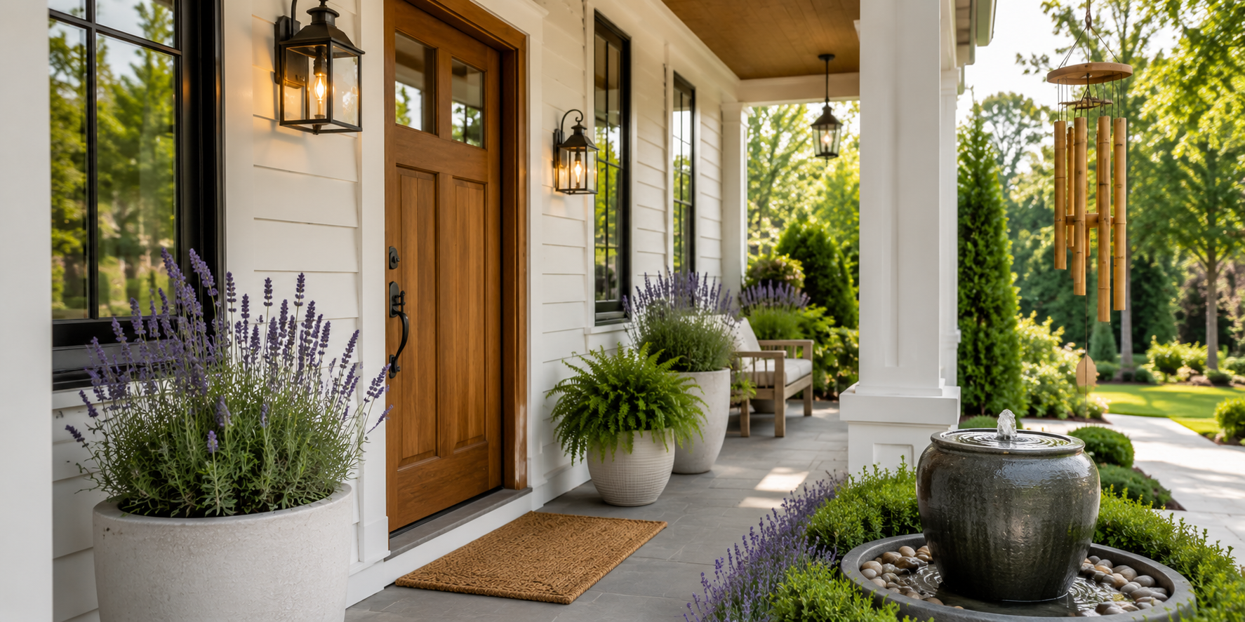
Plants bridge architecture and landscape, breathing vitality into hard materials. Combine evergreen shrubs for structure with flowering varieties for accent. Vary pot heights—tall urns at the corners, mid-height planters near seating, hanging baskets overhead—to guide the eye through layers of green.
Choose hardy species such as boxwood, fern, or dwarf palms that endure across seasons. Terracotta and stone planters develop patina that enhances authenticity over time. Groupings of three or five feel natural and balanced, echoing the asymmetry found in gardens.
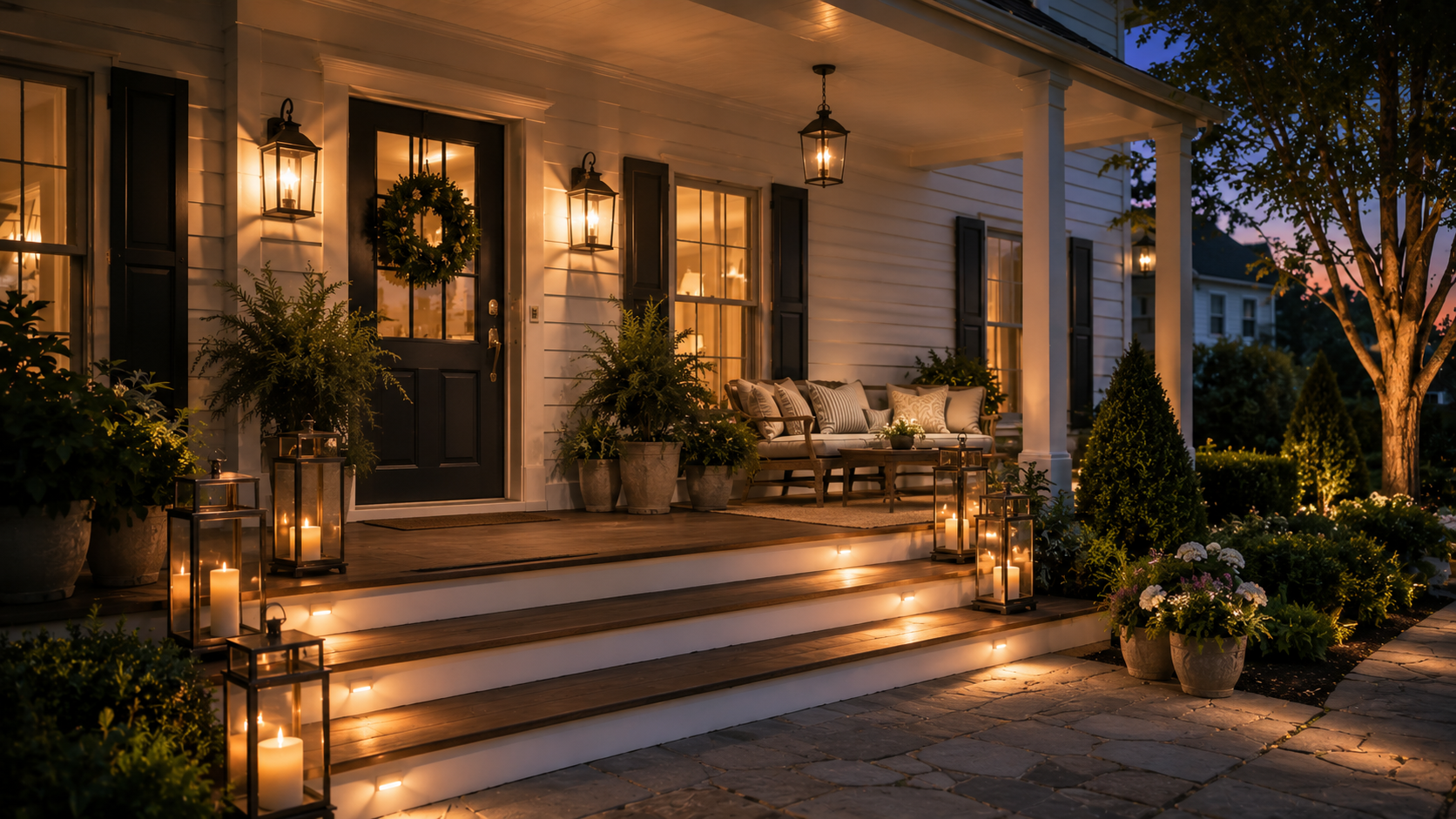
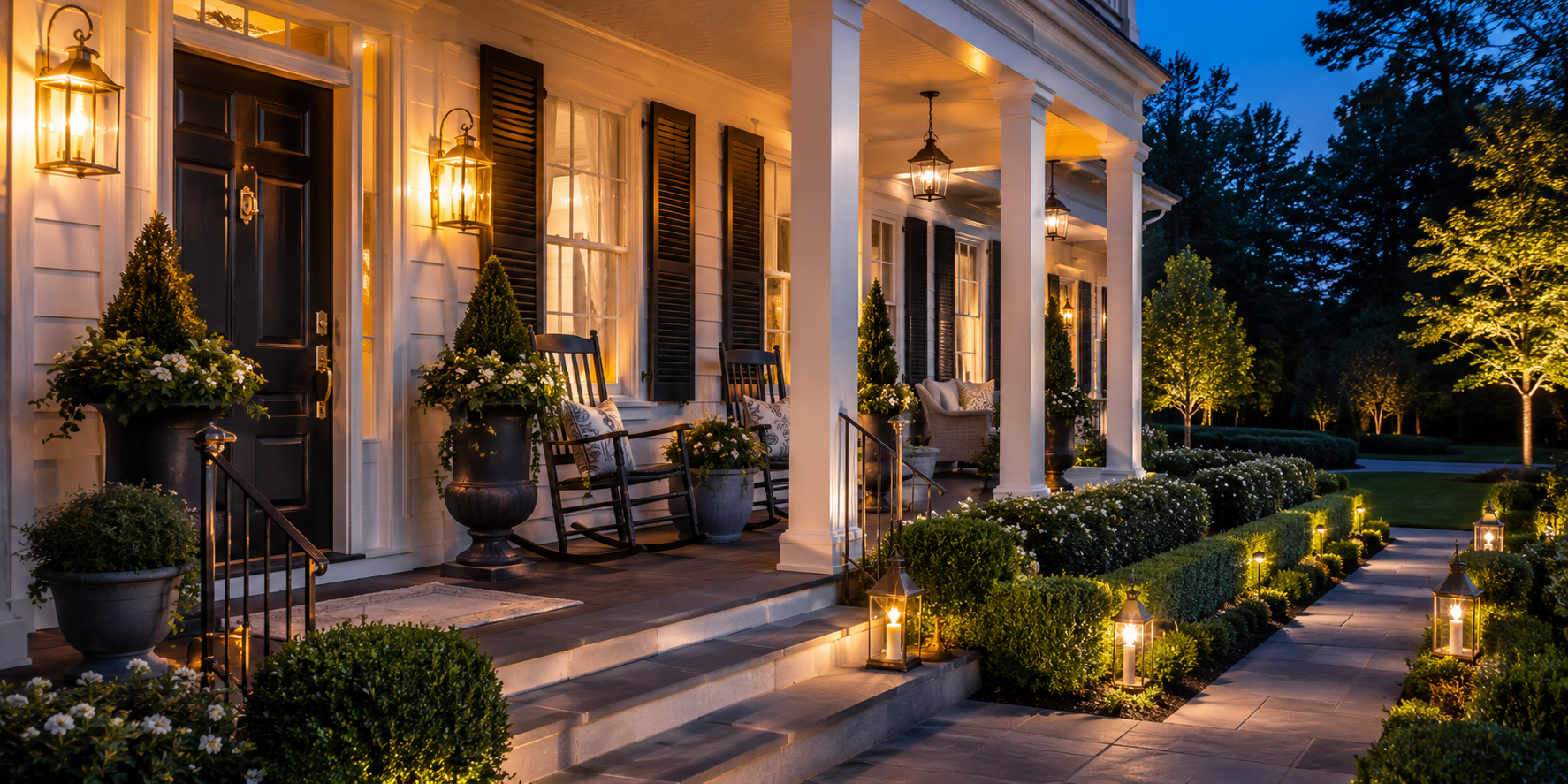
Light defines emotion after sunset. Blend overhead fixtures with sconces, lanterns, and candles to create depth. Warm bulbs in the 2700 K range mimic firelight, flattering both people and architecture. Avoid pure white LEDs that flatten color.
For safety, illuminate steps or pathways with low-profile fixtures while keeping glare minimal. A porch should glow rather than shine. Installing a dimmer allows transitions—from bright welcome light during gatherings to a soft shimmer for quiet nights.
Authentic materials lend credibility. Natural wood, brick, and stone develop depth as they weather; synthetic imitations often fade unevenly. If your home already features one dominant material, echo it on the porch for harmony. For example, match brick steps to the home’s foundation or continue siding color onto railing spindles.
Seal wooden floors to resist moisture yet preserve visible grain. A matte finish reflects light softly and hides wear. These enduring textures ensure the porch looks refined decades from now without constant reinvention.
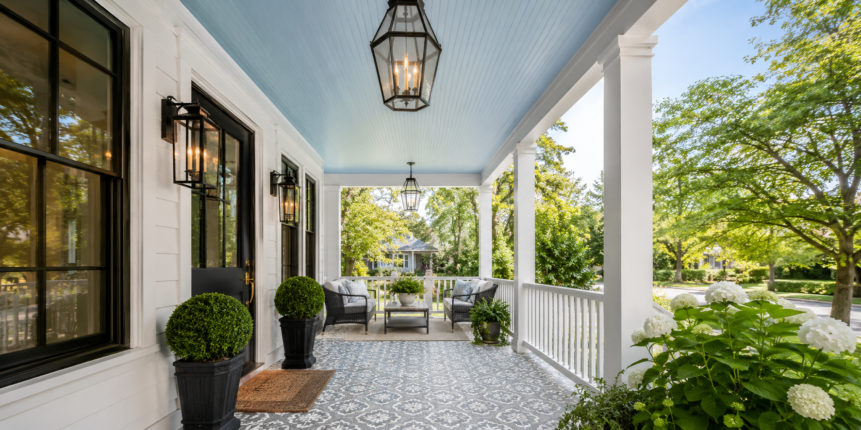
Porch ceilings and floors quietly shape perception. A pale blue ceiling—historically called “haint blue” in Southern design—feels open and airy, reflecting light deeper into shaded spaces. Meanwhile, patterned cement tiles or wide-plank boards ground furniture groupings.
If your porch is deep, lighter flooring brightens it; if shallow, darker tones add visual weight. Layer a woven rug over wood for softness underfoot, but keep patterns subtle so the architecture remains star. Both ceiling and floor should frame, not fight, the composition.
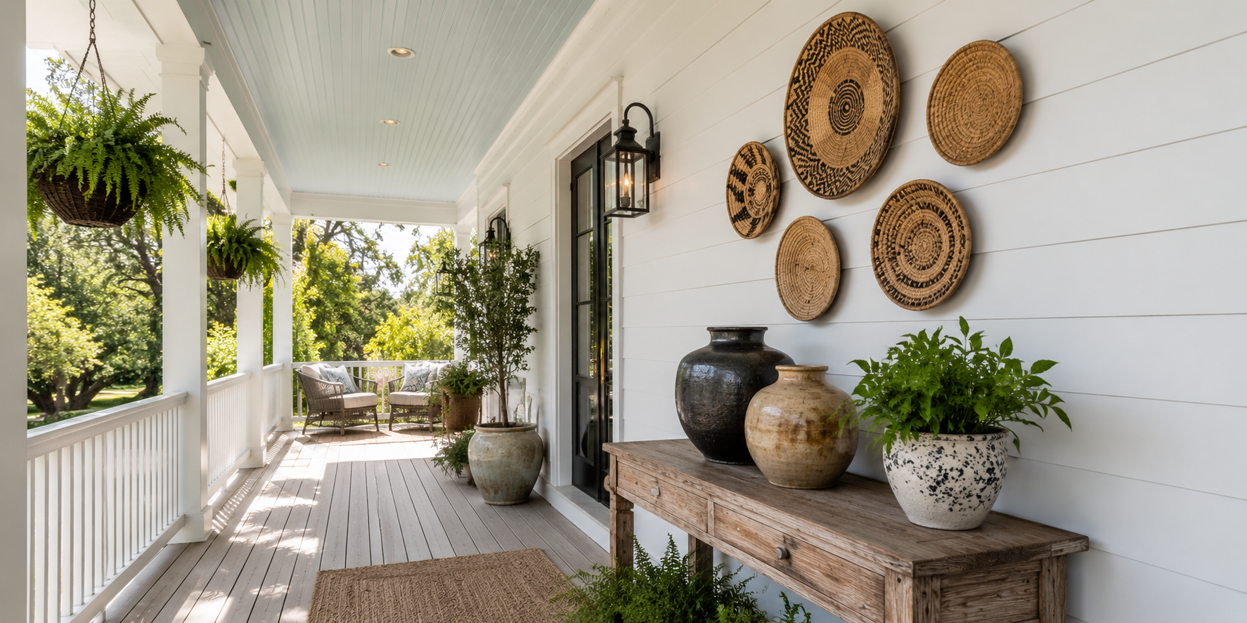
A timeless porch still deserves personality. Display a single piece of wall art—a vintage sign, woven basket, or framed botanical—that hints at the homeowner’s taste. A slim console table can hold sculptural vases or a stack of gardening books without crowding the entry.
Limit accessories to natural textures and muted palettes. The key is editing: a few meaningful objects feel curated, while too many confuse the narrative. Think of it as quiet storytelling—the difference between conversation and noise.
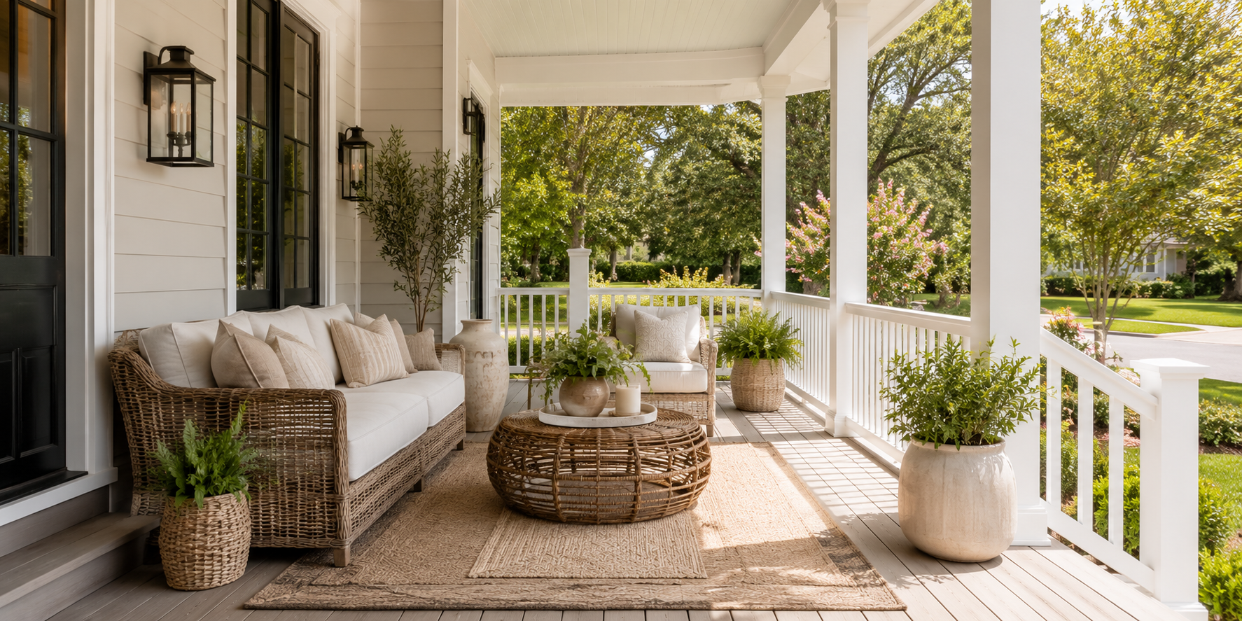
Texture adds dimension where color stays calm. Mix woven jute rugs with cotton cushions and rattan tables. Linen curtains can filter sun on exposed porches while adding softness to angular architecture.
Keep the palette cohesive—stone, sand, and ivory—so texture becomes the visual drama. Under evening light, tactile contrasts between smooth metal and rough fiber create subtle richness. Choosing quality outdoor fabrics ensures these tactile pleasures remain beautiful through sun, rain, and time.
Architectural trim quietly communicates craftsmanship. Paneled columns, crown moldings, or detailed railings give depth and permanence to a façade. Even modest updates—painting column bases in a contrasting tone or adding narrow molding around the door—instantly sharpen the look.
If your porch lacks built-in character, you can simulate it through proportion: frame the doorway with wider casing, add vertical slats beneath the railing for rhythm, or install beadboard wainscoting on interior walls. These details catch light differently throughout the day, adding texture and movement without overwhelming the architecture. A well-framed entry acts like a picture border, elevating everything inside it.
A front path is choreography—it directs how guests approach and perceive the home. Materials such as brick, stone, or decomposed granite create a natural cadence underfoot, while edging with small hedges or solar lanterns emphasizes rhythm.
The transition from path to porch should feel intentional. Use a generous doormat, ideally three-quarters the width of the door, layered over a larger woven rug for scale. Neutral tones hide dirt and complement any season. The combination of texture and proportion signals refinement even before guests knock. Because paths endure heavy use, choose surfaces with slight color variation to conceal wear; irregularity reads as charm, not imperfection.
Pairing materials that age differently creates dialogue. Metal introduces sleekness; wood contributes warmth. Together, they keep a porch visually balanced through all seasons.
A matte-black iron pendant above a honey-toned table, bronze railings against painted clapboard, or galvanized planters beside cedar siding—all express timeless harmony. Repeat each finish in at least two places so the composition feels intentional, not random.
This contrast also improves durability: metals handle weather exposure, while wood softens the atmosphere. The subtle tension between them—cool and warm, hard and soft—mirrors the balance of nature and structure that defines inviting design.
Color sets mood faster than furniture ever can. For a porch that transcends fads, lean into a neutral foundation—ivory, greige, or driftwood gray—then weave in one or two restrained accents. Navy cushions, terracotta pots, or muted green shutters add liveliness without dictating season.
Under daylight, neutral surfaces reflect softness; under warm evening light, they glow gently. Because these tones complement every flower, plant, and holiday accent, they spare you the need for frequent redecorating.
When repainting trim or railings, test samples in varied lighting; hues shift dramatically between morning sun and porch shade. Aim for balance rather than brightness—the hallmark of timeless calm.
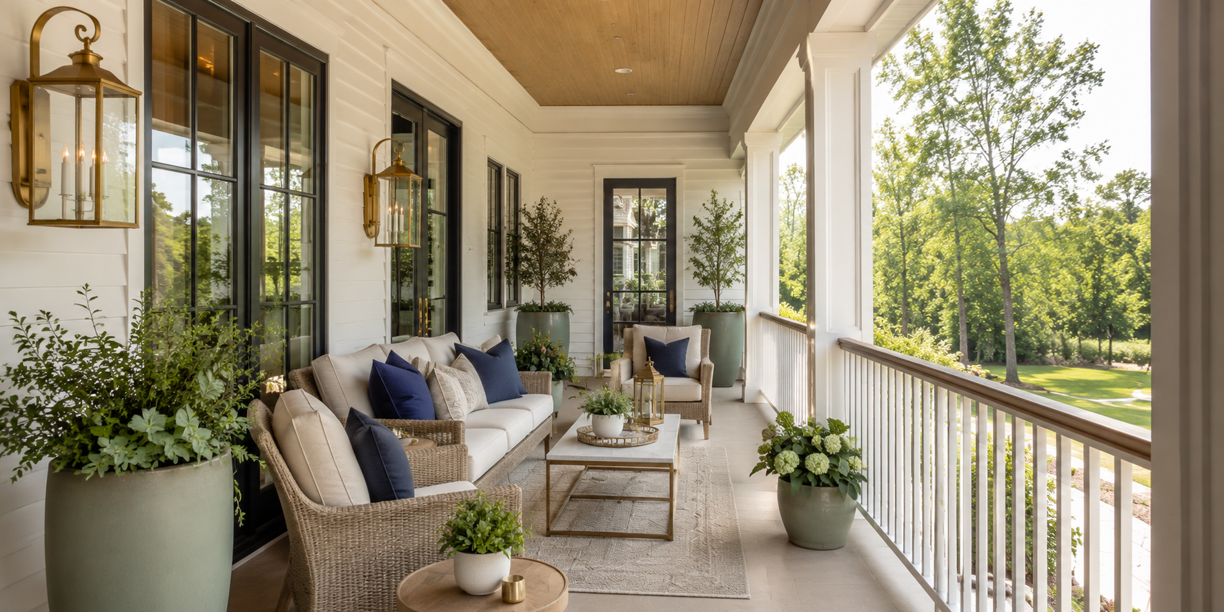
Lighting fixtures are the jewelry of a façade—small but transformative. Classic lanterns with clear glass, gooseneck sconces, and globe pendants remain elegant decades after trends fade.
Select finishes that echo existing metals: brass for warmth, blackened steel for contrast, or brushed nickel for coastal restraint. Mount fixtures slightly above eye level so they illuminate faces without glare.
To extend longevity, choose fixtures rated for damp environments and fit them with LED filament bulbs that mimic vintage glow. When the light temperature harmonizes with natural dusk, the entire porch becomes a softly glowing beacon rather than a harsh spotlight.
Beauty endures when it hides practicality well. Benches with lift-top lids keep blankets, shoes, or gardening tools out of sight while providing extra seating. A pair of woven trunks stacked near a wall becomes both sculpture and storage.
Match textures to the rest of the porch—rattan for breezy cottages, painted wood for colonials, or dark wicker for contemporary homes. Inside containers, use waterproof liners to protect fabrics from humidity. This small discipline ensures the porch always reads tidy, never utilitarian. Even umbrella stands or boot trays can participate in design if chosen in natural tones that complement flooring rather than contrast sharply with it.
Scent and sound shape memory as much as sight. A faint aroma of rosemary or jasmine makes guests unconsciously relax. Plant fragrant herbs near railings so brushing past releases freshness. For sound, a small bubbling fountain or a bamboo wind chime introduces gentle rhythm without distraction.
When designing for longevity, avoid strong seasonal scents like cinnamon or pine; instead favor botanical or citrus notes that feel appropriate year-round. Keep noise elements minimal—soft enough to blend with birds and rustling leaves. These cues transform an ordinary threshold into an immersive sensory experience, the hallmark of every great porch.
Timeless beauty shouldn’t demand constant attention. Opt for outdoor-rated fabrics, powder-coated metals, and UV-stable paints. Seal wood annually with clear matte finish to maintain grain without gloss.
Group plants by sunlight and watering needs so upkeep feels effortless. Use self-watering containers with concealed reservoirs and swap annuals seasonally while evergreens hold structure. Clean lantern glass quarterly to prevent dullness—light clarity influences perception of cleanliness more than you might think.
A low-maintenance porch remains consistently photogenic, a key for Pinterest-ready curb appeal. Durability sustains design integrity—the less you fight weather, the longer elegance lasts.
Scale is what separates amateur arrangement from professional composition. Furniture, railings, and décor must relate to each other and to the architecture. On small porches, slim chairs with open frames maintain visual air; on wide ones, heavier silhouettes anchor the space.
A good rule: furniture height should sit roughly one-third the height of the door to keep balance. Planters should never exceed railing height unless flanking an open step. Step back to view the entire façade from the sidewalk—if your eye stops smoothly at the door, proportions are right. Getting scale correct once saves years of rearranging; timeless design feels inevitable, as though it always belonged.
Night reveals personality different from day. Combine ambient porch lights with subtle landscape uplighting to make architectural lines glow. Polished metal fixtures catch these highlights, adding quiet sparkle visible from the street.
Clean glass regularly so light remains clear; dusty bulbs cast gray light that dulls color. Keep greenery trimmed to frame, not obscure, illumination. The faint shimmer of candles through windowpanes, the reflection on a brass doorknob—these small gleams tell neighbors and visitors alike that the home is loved. Even after the lights go out, balanced composition leaves silhouette and shadow that maintain presence. True curb appeal endures 24 hours a day.
A Welcome That Endures. A porch is more than architecture—it’s an emotion crafted from proportion, texture, scent, and sound. The best designs feel inevitable, as though the house and landscape grew together. By focusing on authenticity—solid materials, restrained color, layered lighting, and lived-in comfort—you create an entryway immune to changing trends.
Each of these 19 front-porch decorating ideas proves that timeless style isn’t about perfection; it’s about balance, calm, and continuity. The soft creak of a rocker, the warmth of lantern light, the scent of herbs after rain—these are what make a home feel genuinely welcoming, season after season, year after year.
G2G Team
05-22-2026
Let’s Build
Contact us todayGet daily tips and tricks for making your best home.
2025 Green to Gorgeous