Have you ever stepped into a room and felt instantly energized — not by noise or brightness, but by warmth, depth, and emotion? That’s what red brings to interior design. It’s the color of confidence, comfort, and connection, all wrapped in a single, passionate tone. For decades, designers have debated whether red belongs in the bedroom. Too bold, they said. Too stimulating. But when used thoughtfully, red can do something no other color can — it turns a bedroom into a living expression of personality. It’s romantic without being saccharine, bold without being harsh, timeless without being predictable. From soft terracotta and muted burgundy to fiery scarlet and deep wine, red carries countless moods. Whether you want a cozy rustic retreat or a high-glam sanctuary, red adapts beautifully. The key lies in how you layer it — your textures, finishes, light, and accessories.
In this guide, you’ll explore 13 red bedroom ideas that balance passion with serenity, drama with subtlety. Each one reveals how to weave this dynamic color into your personal space — not as a statement of excess, but as a reflection of depth, elegance, and individuality.
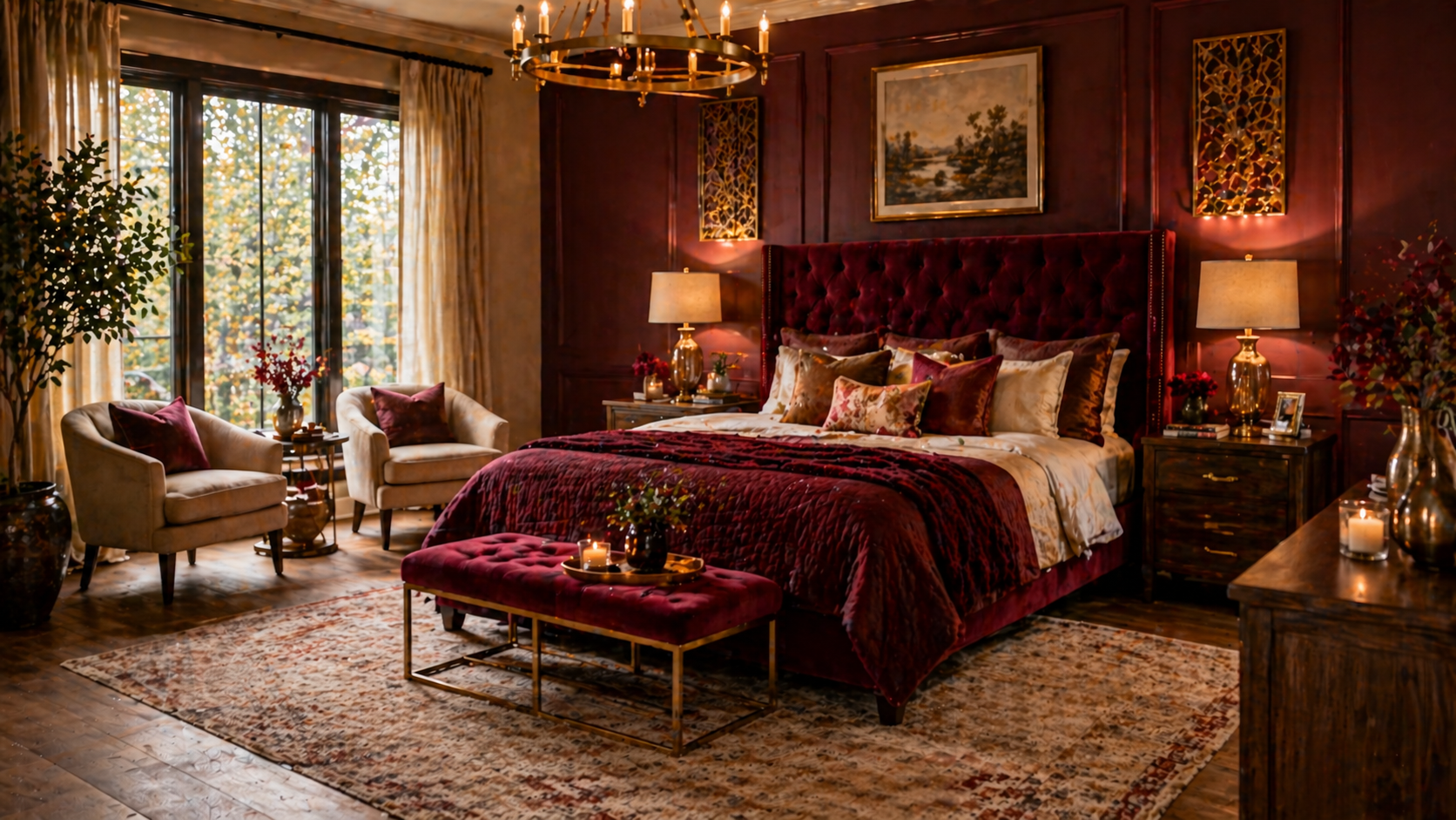
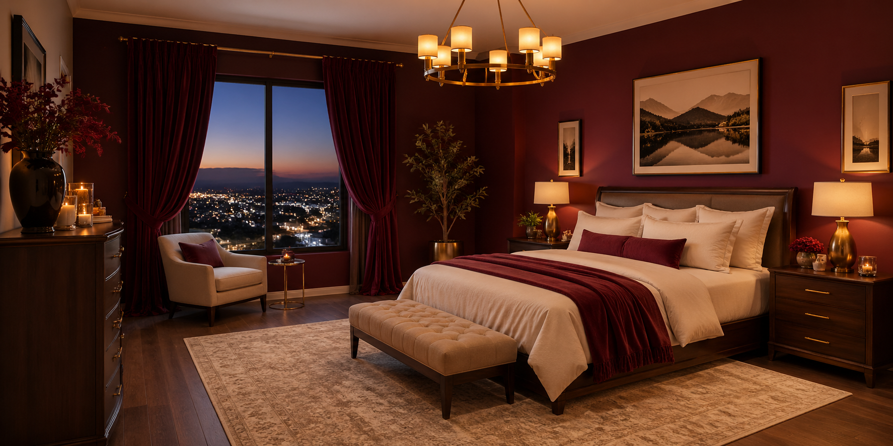
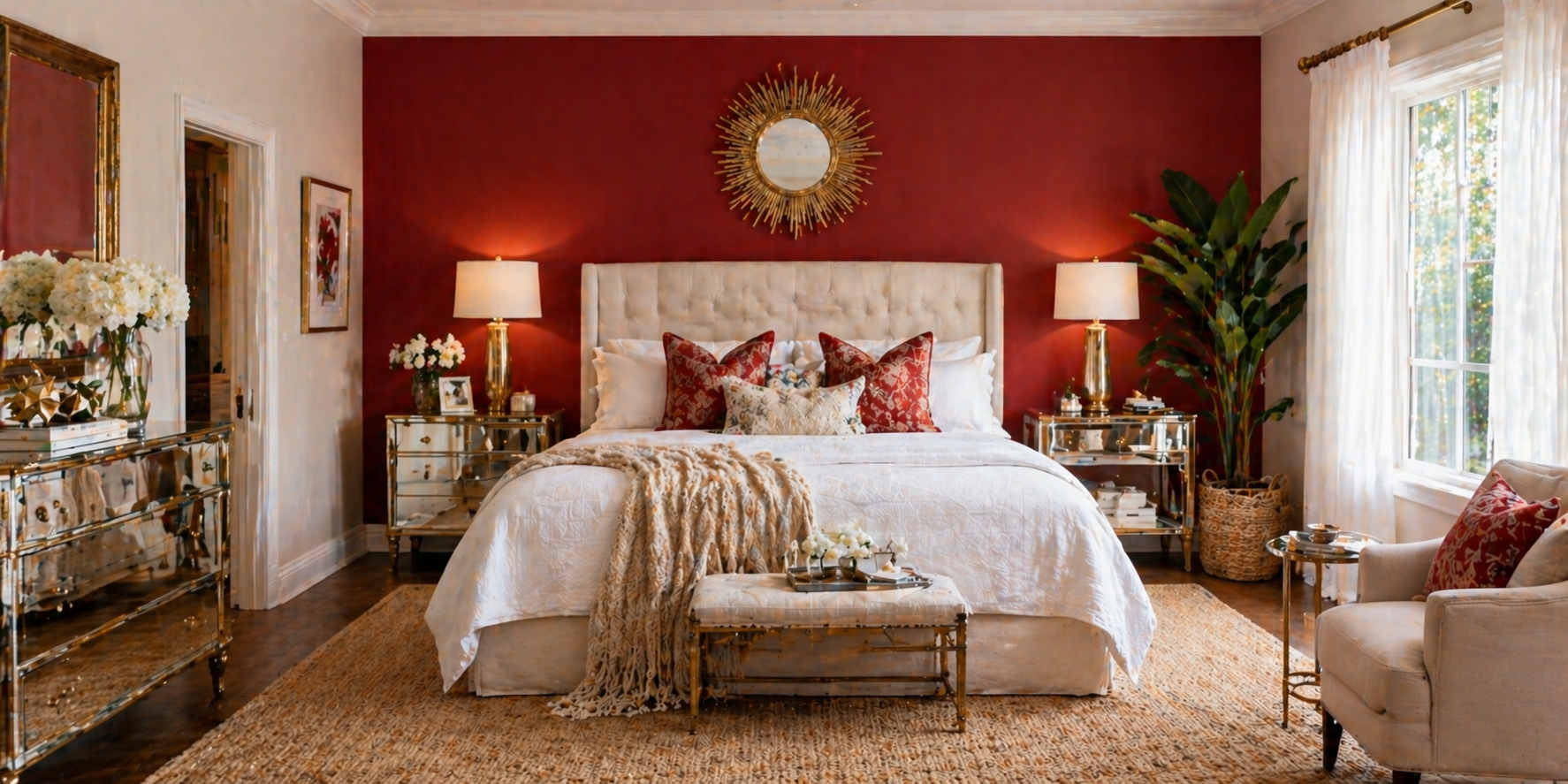
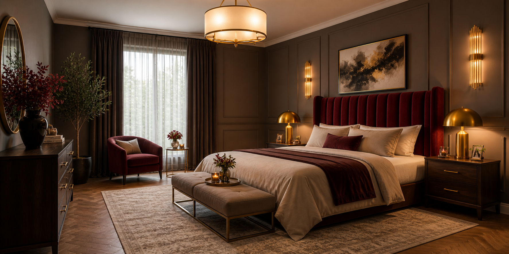
Burgundy is the shade that whispers instead of shouts — a luxurious blend of red’s intensity and brown’s stability. It feels mature, grounded, and effortlessly rich. Start by introducing matte burgundy walls or wallpaper with a suede-like texture that catches light softly. Pair these with off-white or cream bedding to lighten the mood, and add gold-framed mirrors or brass side lamps for subtle warmth. The goal is to build layers of richness without visual heaviness. In larger rooms, you can even try monochromatic layering — varying tones of burgundy across textiles, from plum velvet curtains to wine-colored cushions. This creates depth through nuance rather than contrast. If you’re designing for evening ambience, use dimmable amber lighting (2700K) to give the burgundy undertones a romantic, candlelit glow. In daylight, the color transforms beautifully — deep but never oppressive.
Pro Tip: To balance the richness, bring in tactile contrasts like linen throws, woven rugs, or natural wood furniture. These organic materials add breathability to a color that might otherwise feel too opulent.
Design Highlights:
Scarlet isn’t subtle — and that’s what makes it special. It brings energy, emotion, and boldness into the heart of your bedroom. The key to making scarlet work is restraint: one strong feature, surrounded by calm. Choose a scarlet accent wall behind your bed to create a natural focal point. Balance it with crisp white ceilings and pale gray or beige flooring to give your eyes a place to rest.
Add metallic accents in gold or bronze for a glamorous undertone, or use natural textures like rattan and linen to soften the modern edge. For an intimate, moody feel, pair scarlet with charcoal grays, black accents, and plush bedding. For a romantic coastal touch, introduce whites, creams, and driftwood textures to lighten its drama.
Pro Tip: Scarlet thrives under warm, directional lighting. Wall sconces and shaded table lamps create shadows that enhance its depth, making the room feel like it’s glowing from within.
Design Highlights:
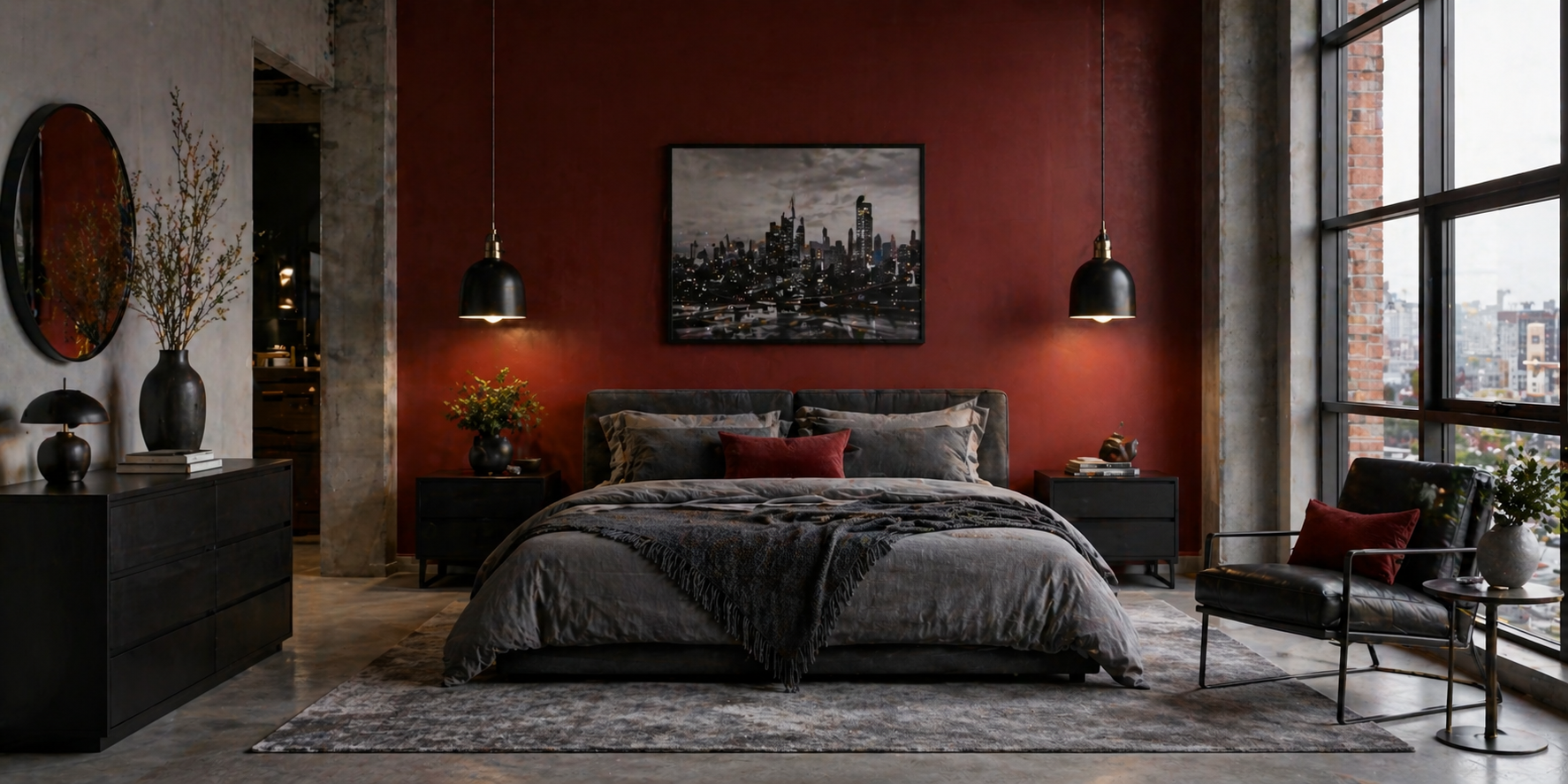
Few combinations feel as modern and confident as red and gray. Red energizes the space while gray cools it down, creating a dynamic yet restful balance. Opt for a charcoal gray wall as a canvas and bring in red through accents — pillows, art, or a single armchair. Alternatively, paint a matte red wall and temper it with slate-gray furniture or silver fixtures for a crisp, urban finish.
Layer textures to prevent flatness: a wool throw on a linen bedspread, a glossy lacquer nightstand beside matte paint, or glass lamps on brushed-metal bases. These contrasts make the room feel alive even in monochrome settings.
Lighting Tip: Go for adjustable warm-white light — cool white can make gray look sterile and red too harsh.
Budget Tip: Even small pops of red — like a throw blanket or an abstract painting — can modernize a plain gray room without repainting.
Design Highlights:
You don’t have to drench your bedroom in color to make an impact. Sometimes, all it takes is a few strategically placed red accents to create focus and warmth. Think of a neutral base palette — beige walls, white bedding, light wood floors — then punctuate the space with red elements like pillows, throws, ceramic vases, or artwork. Even something as simple as a single red chair or bedside lamp can elevate a minimalist room into something expressive and intentional.
Layering is key. Try mixing textures and shades of red: a deep crimson pillow beside a faded terracotta rug adds complexity while maintaining harmony. Lighting Insight: Accent lighting — like wall-mounted spotlights or small table lamps — can highlight red accessories and enhance their warmth during evenings.
Design Highlights:
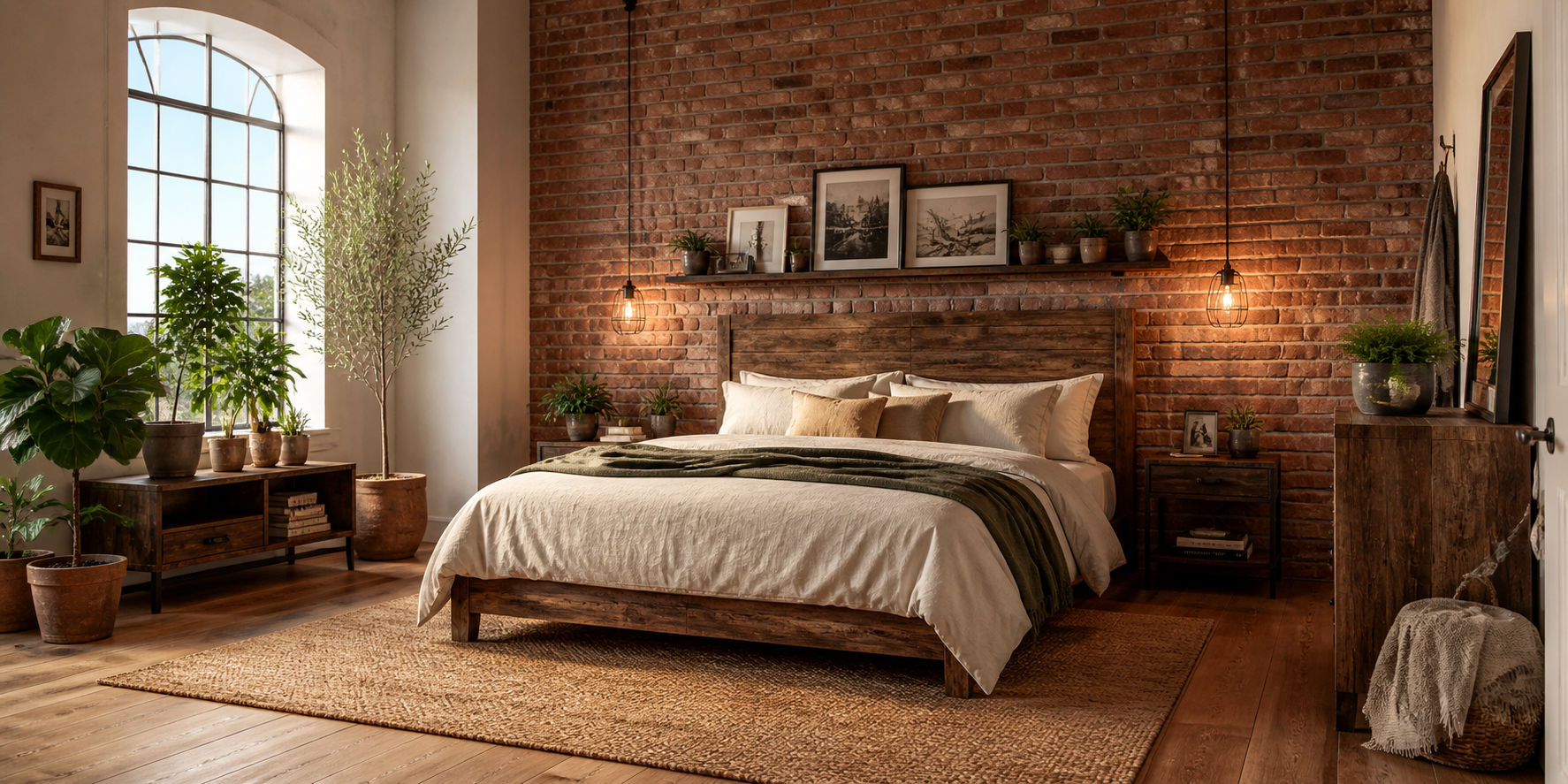
Brick red carries a natural, grounded energy. It feels familiar — reminiscent of fireplaces, farmhouses, and heritage architecture — making it ideal for rustic or cottage-inspired bedrooms. If you’re lucky enough to have exposed brick walls, celebrate them. If not, try brick-effect wallpaper in warm clay or terracotta tones. Combine these with weathered wood furniture, handwoven rugs, and metal accents in black or bronze. This look thrives on imperfection. Uneven textures, visible brushstrokes, or aged finishes enhance its authenticity.
Style Variation:
Design Highlights:
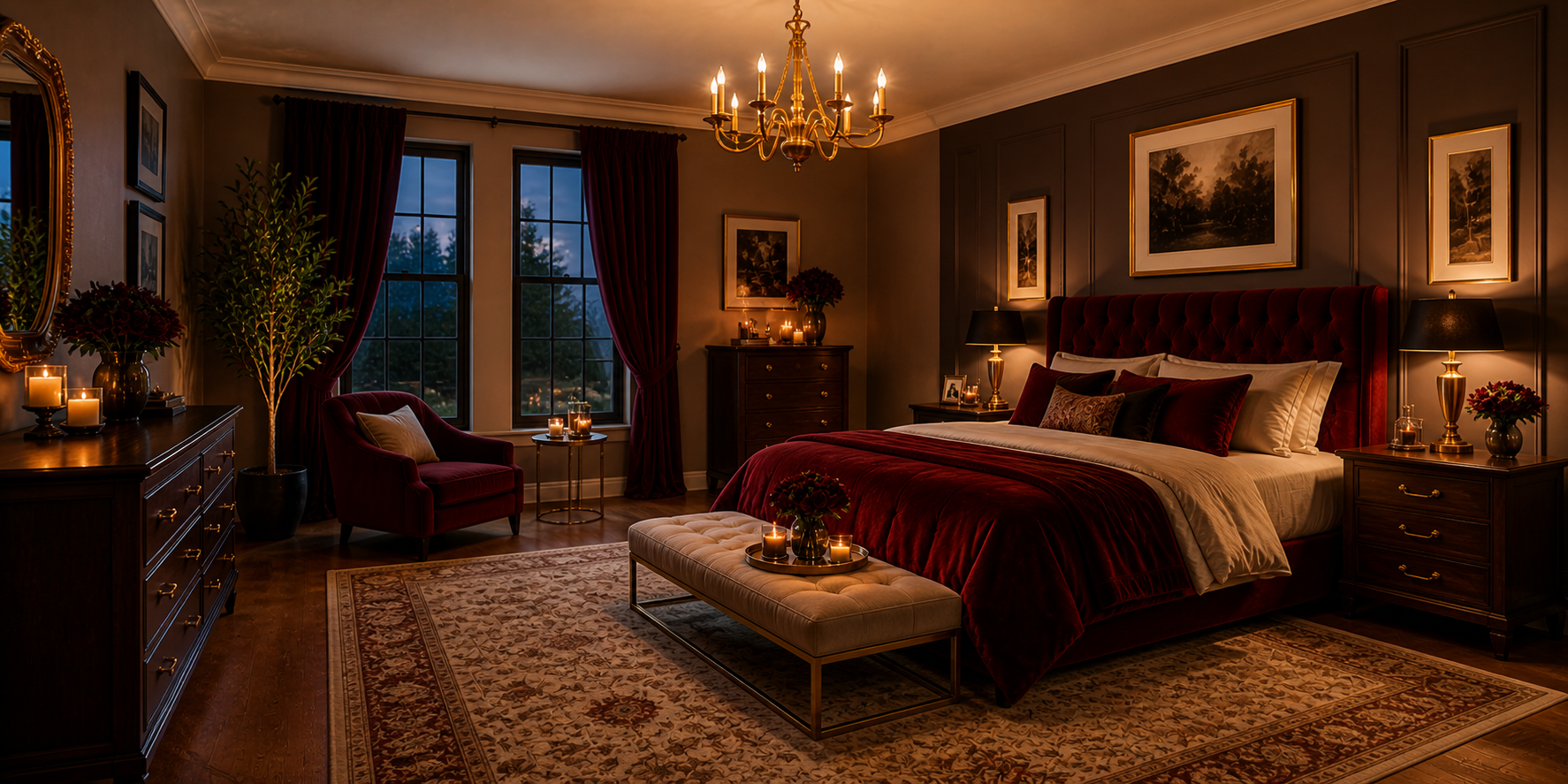
Velvet and red share the same DNA — bold, tactile, and sensuous. Together, they create a look that’s both opulent and intimate. Start with a velvet headboard or curtains in ruby, wine, or plum-red tones. The soft, light-catching texture of velvet transforms how color behaves — deeper at night, luminous in daylight. Add metallic accents like brushed brass or antique gold to complement the plush aesthetic. If you prefer a modern interpretation, choose velvet cushions or a footstool in cranberry or cherry red paired with matte black or soft gray furniture.
Pro Tip: Velvet benefits from natural daylight; it keeps the color alive and reveals its subtle sheen. At night, directional lighting enhances its lush depth.
Design Highlights:
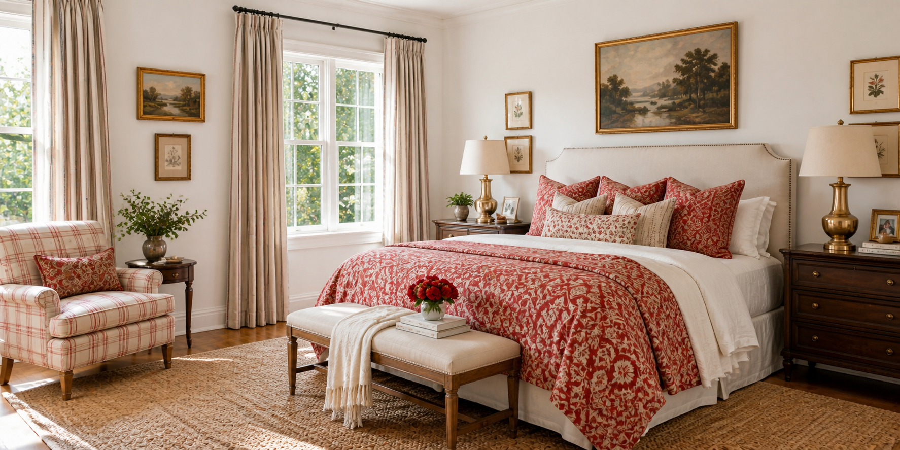
When red feels too strong, pairing it with white brings instant clarity and balance. This timeless combination brightens the space while keeping the energy alive. Choose white walls with red textiles — think checkered throws, striped cushions, or floral duvets. For a more traditional look, red-and-white toile or gingham patterns add a soft vintage charm.
Alternatively, reverse the balance: red walls with crisp white furniture. This works beautifully in coastal or retro-inspired bedrooms. Add greenery or wicker accents to make the palette feel fresh rather than stark.
Pro Tip: For small bedrooms, keep ceilings white and choose lighter red tones like coral or cherry to visually expand the room.
Design Highlights:
Few color pairings embody elegance quite like red and gold. Together, they recall everything from old-Hollywood sophistication to regal European interiors — yet they can be interpreted in countless modern ways. For a classic luxury approach, choose a deep red velvet or silk duvet cover and complement it with brushed gold picture frames, lamps, and drawer handles. Keep other tones neutral — ivory walls, dark wood floors — to let the richness shine without overpowering.
If you prefer something contemporary, try matte gold finishes instead of metallic shine. A muted gold headboard or light fixture can bring the same warmth with subtlety. In small spaces, replace heavy drapery with sheer linen curtains and gold tiebacks to maintain airiness.
Lighting Strategy: Golden hues thrive under layered light. Use table lamps for warmth, ceiling lighting for diffusion, and hidden LED strips for accent glow. The interplay of warm light and reflective surfaces amplifies depth and glamour.
Stylist’s Note: Don’t just think of gold as color — think of it as texture. A gold velvet cushion, metallic-thread rug, or brass wall art can reflect light differently, adding visual intrigue from every angle.
Design Highlights:
Image Prompt:
 , 4:3 ratio
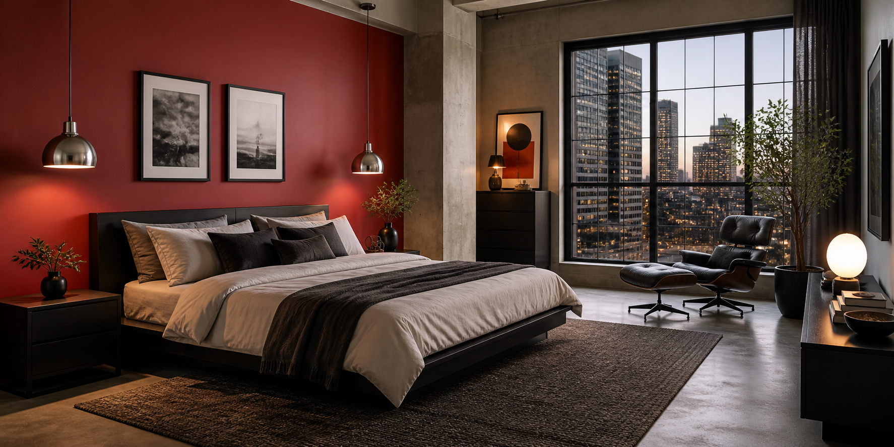
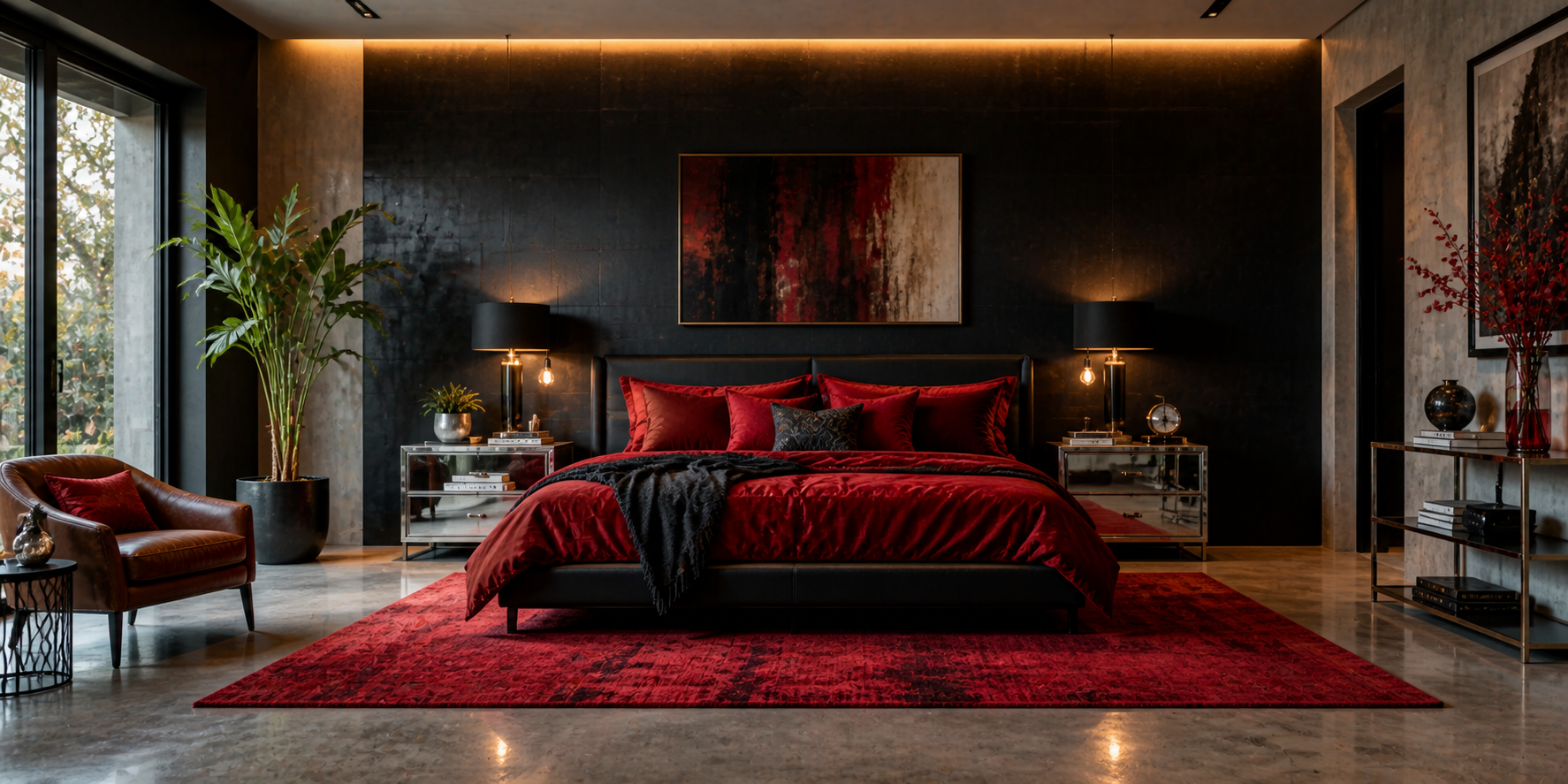
The red-and-black combination commands attention. It’s striking, moody, and full of architectural confidence. Used properly, it can turn a plain bedroom into a bold design statement that feels intentional and chic. Start with matte black or charcoal-gray walls — they absorb light, making red accents glow more vividly. Then introduce red through bedding, wall art, or upholstered furniture. Keep the lines clean and the shapes modern; this palette works best when clutter-free. To soften the contrast, layer in warm neutral textures like tan leather, dark wood, or gray wool. These materials keep the scheme from feeling too stark.
Lighting Tip: Red and black benefit from soft, warm illumination. Install dimmers and amber-toned bulbs (2400K–2700K) for cinematic warmth, especially at night.
Mood Layering: If pure red feels intense, experiment with burgundy or maroon instead. These shades maintain depth but reduce visual strain, allowing the space to feel moody rather than overpowering.
Design Highlights:
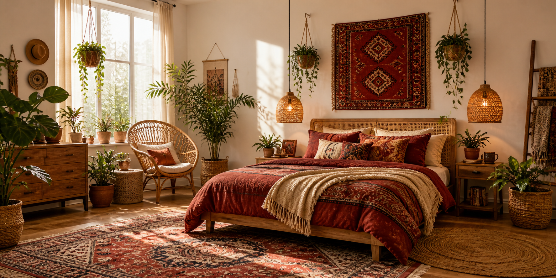
Red feels at home in bohemian design — it’s expressive, layered, and rich in cultural warmth. The boho palette welcomes imperfection and embraces texture, making red one of its most harmonious elements. Start with a neutral foundation — white or beige walls — and build layers of pattern and texture using rugs, pillows, tapestries, and quilts in shades of red, rust, and terracotta. Mix global patterns — Moroccan, Indian, Turkish — to create visual rhythm and storytelling through color.
Pro Tip: The key to bohemian success is balance. Let your reds range in tone — from bright crimson to dusky brick — but anchor them with earthy neutrals and soft lighting. Add woven baskets, macrame decor, and lush plants to introduce natural contrast. This ensures your reds feel vibrant yet grounded.
Seasonal Touch: In colder months, emphasize reds with velvet and wool. In summer, lighten the palette with cotton throws and woven rugs to keep the look fresh but still soulful.
Design Highlights:
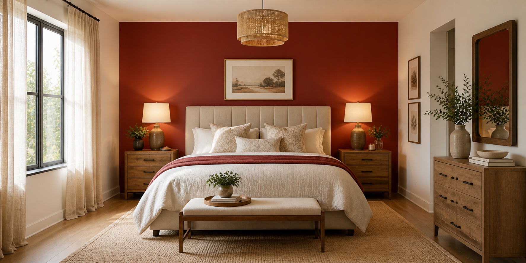
Sometimes, less is truly more. A single red wall — carefully placed — can redefine an entire bedroom. It’s bold yet balanced, and it commands attention without chaos. Position your red wall behind the headboard to naturally frame the focal point of the room. Choose a matte finish to prevent glare, or a subtle textured paint for visual interest. Keep the remaining walls soft and light — ivory, sand, or dove gray — to maintain harmony.
Complementary Elements:
Neutral furniture allows your red wall to dominate gracefully. Choose upholstered headboards in beige or wood tones, and hang black-and-white photography or gold-trimmed art to create refined contrast.
Lighting Trick: A red wall absorbs light; to keep it from feeling heavy, place a floor lamp nearby or install wall sconces that wash the color with warm light, creating a glowing backdrop.
Design Highlights:
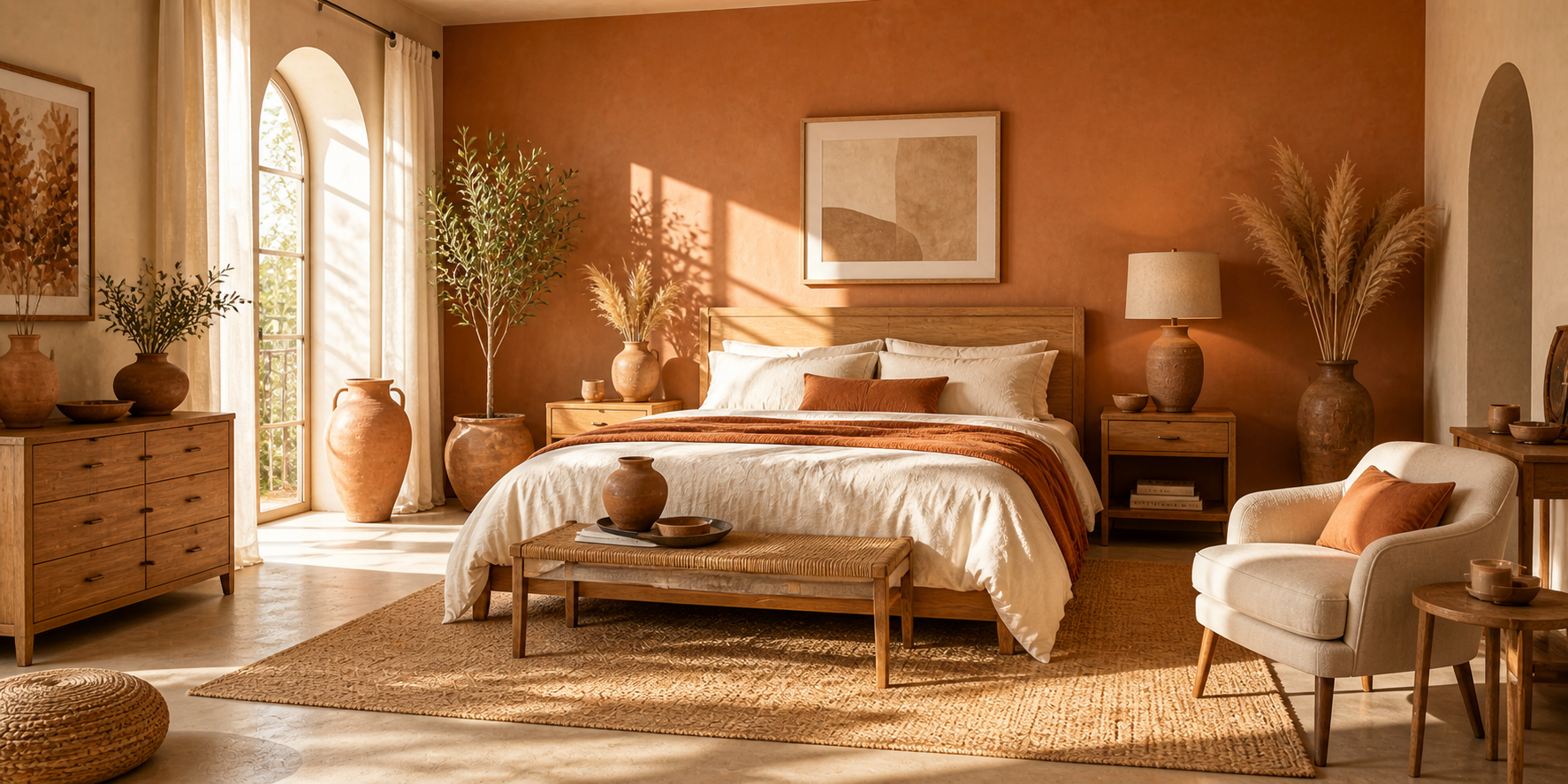
For those who prefer subtlety, terracotta offers a relaxed, earthy alternative to intense reds. It evokes desert sunsets and Mediterranean calm — ideal for creating a sanctuary-like bedroom. Paint walls in soft terracotta or clay hues, then layer with creamy linens, rattan furniture, and handmade ceramics. Unlike pure red, terracotta’s muted warmth works effortlessly with organic materials like linen, oak, or jute.
Pro Tip: Add textural depth through plaster or limewash finishes — the slight irregularities reflect natural light gently, mimicking the glow of clay in sunlight.
Styling Variation:
Lighting Mood: Terracotta thrives under golden-hour light or candlelight, giving your space a permanent sunset glow.
Design Highlights:
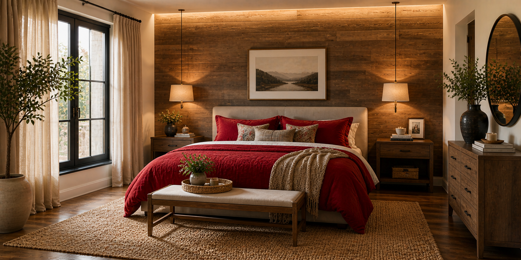
The red-and-wood pairing is one of the most emotionally balanced color relationships in design. Wood brings nature’s calm; red contributes energy and depth. Together, they create harmony that feels both elegant and approachable.
For a modern rustic vibe, pair cherry-red bedding with light oak furniture. For a more dramatic tone, choose mahogany or walnut finishes against deep burgundy or brick-red walls. The play between warmth and texture creates a layered, intimate effect.
Introduce soft lighting through table lamps with linen shades or wall-mounted sconces that reflect gently off the wood. Finish with a woven rug or textured drapery to keep the atmosphere relaxed.
Style Note: This combination suits nearly every design theme — from Scandinavian minimalism to farmhouse comfort. The key is proportion: let either wood or red dominate, and allow the other to act as a complement.
Psychological Harmony: Wood introduces stability and familiarity, grounding red’s passion. The result feels emotional yet steady — a reflection of comfort with a heartbeat.
Design Highlights:
A red bedroom isn’t just a design choice — it’s a declaration of personality. It tells the world that you value warmth over cool detachment, emotion over neutrality, story over silence. Red is the heartbeat of design. It symbolizes energy, love, and confidence, yet when layered thoughtfully, it can also bring serenity and peace. Whether you choose deep burgundy velvet, rustic brick, or soft terracotta, every variation carries its own rhythm. The secret lies in balance. Balance between color and calm. Between texture and tone. Between the light of day and the intimacy of night.
Here’s how to make your red bedroom timeless and livable:
Ultimately, designing with red is an act of confidence. It’s about creating a space that feels alive — a sanctuary that reflects your boldness and your calm in perfect harmony. When done right, a red bedroom doesn’t just look beautiful. It feels like home — deep, vibrant, and unforgettable.
Let’s Build
Contact us todayGet daily tips and tricks for making your best home.
2025 Green to Gorgeous